I am pleased to announce that v3.0.6 of DAX Studio has just been released. You can download this version from https://daxstudio.org and for more details on what’s new in blog post here v3.0.6 Release | DAX Studio
Some of you may have already seen the video from SQLBI showing the new timeline feature in Server Timings – if not, you should definitely watch this as it has some great information on this new feature and how to use it.
In my previous post I had a short 40 line script for Tabular Editor (free | paid) which could generate descriptions for the measures in your tabular model. There were a number of interesting questions in the comments to that post which I thought would make a follow up post worthwhile.
Below is a very brief tutorial on running a script using Tabular Editor 2
If you launched Tabular Editor from the External Tools ribbon in Power BI desktop you can skip this step, otherwise click on this icon to connect to your data model.
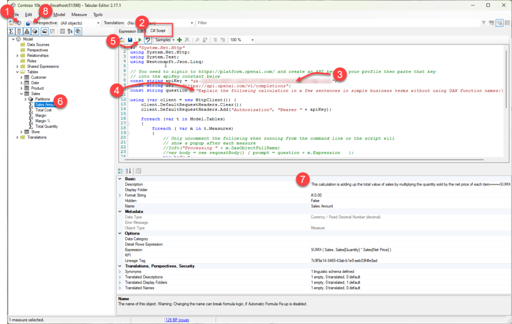
Click on the C# Script tab and paste in the script from my earlier post
There are instructions in my earlier post for requesting your own API key from Open AI you need to paste the key into this line between the quotes (“)
Optional: if you are targeting users that speak a language other than English you can update the question text on line 10 to your desired language (from what I understand ChatGPT understands about 100 different languages so you might need to test if this works in your language)
Click the play button to run the script, this step could take a while depending on the number of measures and whether you hit throttling (more on this below)
Once the script has run you can check some of the descriptions by clicking on a measure in the model explorer. At this point all the descriptions are still local and have not been saved back to your data model.
The text generated by ChatGPT will appear in the Description property for the measure.
If you are happy with the generated descriptions clicking the Save Changes button will save the new descriptions back to your data model.
How to run the script using TE3
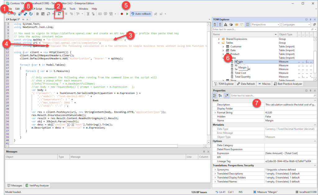
The steps for Tabular Editor 3 are almost the same with the main difference being at step 2 because TE3 allows you to have multiple C# scripts open at the same time.
If you launched Tabular Editor from the External Tools ribbon in Power BI desktop you can skip this step, otherwise click on this icon to connect to your data model.
Click on the New C# Script button to create a C# script document and paste in the script from my earlier post
There are instructions in my earlier post for requesting your own API key from Open AI you need to paste the key into this line between the quotes (“)
Optional: if you are targeting users that speak a language other than English you can update the question text on line 10 to your desired language (from what I understand ChatGPT understands about 100 different languages so you might need to test if this works in your language)
Click the play button to run the script, this step could take a while depending on the number of measures and whether you hit throttling (more on this below)
Once the script has run you can check some of the descriptions by clicking on a measure in the model explorer. At this point all the descriptions are still local and have not been saved back to your data model.
The text generated by ChatGPT will appear in the Description property for the measure.
If you are happy with the generated descriptions clicking the Save Changes button will save the new descriptions back to your data model.
Dealing with Rate Limiting
If you have not worked with API calls before you may not have come across the term “rate limiting” before. Basically, it is a mechanism that APIs use to prevent users from monopolizing the resources on a service by limiting the number of calls that can be made within a given timeframe.
In the case of the Open AI APIs they document their rate limits here and at the time of writing they only allow 20 calls per minute for a free account. Once you hit that limit the API will return a 429 error code which is a common code meaning “Too many requests”. There are 2 approaches that you can use to work around this.
You can add pauses in the code to wait until the next minute when you can then make another 20 calls.
You can upgrade to a paid account which has much a higher limit.
If you would like to see an example of an updated script which will skip measures which already have descriptions (so if you’ve manually updated some or if there was an issue part way through running a previous script
The Large Language Model (LLM) behind ChatGPT is an amazing piece of technology and it’s only going to get better over time. But I’ve also seen it described as “a B grade intern who hallucinates occasionally”. In it’s simplest form all these AI models do is to break a piece of text into a series of tokens and then predict what tokens are likely to come next based on a corpus of training material.
In my testing I’ve seen a number of examples where the prediction has missed some important detail. And in a couple of cases, I’ve even seen it include a modification to the original measure and then it has described the modified measure, not the original one!
So, while this is definitely a huge time saver, just be aware that it’s not perfect. Before publishing these descriptions into production, I would suggest doing a review of them to ensure that they make sense and include all the important details.
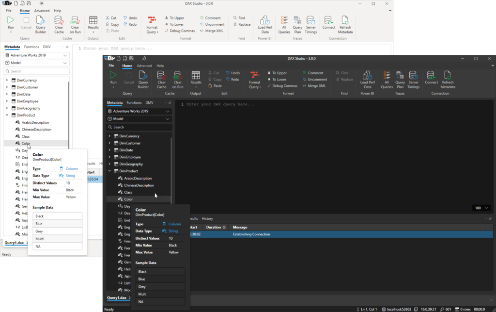
If you want to see all the descriptions at once you can use a tool like DAX Studio to run the following query to list them.
SELECT [Name], [Description], [Expression] FROM $SYSTEM.TMSCHEMA_MEASURES
Note: Make sure to go on and read part 2 after reading this which has some improvements to the script.
It seems like everyone is playing with ChatGPT at the moment and doing everything from getting it to write code for them to asking it to write ode’s to their favourite visuals. Writing DAX code is interesting from the perspective of someone building a data model. But one thing that has always been hard from the perspective of consumer of a data model is understanding the logic behind those DAX calculations.
As you’ve probably already guessed from the title of this post rather than generating DAX I wanted to see if we could go the other way and get ChatGPT to provide simple descriptions of what a DAX expression was doing.
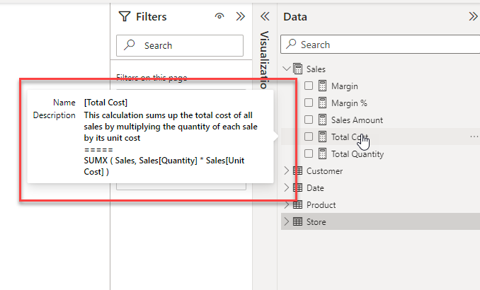
To test this I did not want to use a basic measure, so I found a moderately complex expression that someone else had actually originally had ChatGPT generate for them and ask it to explain the calculation. The first time I tried this it produced a very long description breaking down each of the function calls. But by revising the way I asked the question I eventually got to a point where it was giving me a nice concise explanation.
When I posted the following question to ChatGPT:
Explain the following calculation in a few sentences in simple business terms without using DAX function names:
CALCULATE (
   SELECTEDVALUE ( 'Suppliers'[CompanyName] ),
   TOPN (
      1,
      SUMMARIZE (
         Products,
         'Suppliers' [CompanyName],
         "@StockValue", SUMX( 'Products'[UnitsInStock] * 'Products'[UnitPrice] ),
      [@stockValue],
       DESC
   )
)
It came back with the following answer which I was pretty happy with:
This calculation is finding the company name of the supplier with the highest total value of stock for a given product. It does this by first multiplying the units in stock by the unit price for each product, then summarizing that total value by supplier. It then finds the top supplier by that total value and returns their company name.
This was great for a single measure, but not all of the consumers of your data model will have access to view the DAX expression. And even if they did it would be a pain to have to keep jumping out to an external website to understand what every measure is doing.
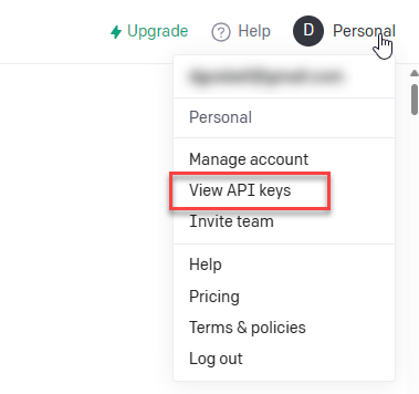
So this made me wonder if there might be some way of injecting these descriptions into the data model. And as it turns out ChatGPT already has a REST API. All you need to do is to sign up for an account at https://platform.openai.com (if you’ve been experimenting with ChatGPT you probably already have an account) and then generate an API key for your account and you can make requests of ChatGPT from another program.
View and Create API keys from the account link in the top right corner
Note: free accounts are limited to 20 calls per minute (see Rate Limits – OpenAI API ). So for large models you would either need to add logic to include a 1 minute delay every 20 measures or upgrade to a paid plan.
From there I setup the following Tabular Editor script which will loop through all of the measures in your data model and update the description with the one generated by ChatGPT. All you need to do to run this is to paste your own API key into the apiKey constant on line 8.
For illustration purposes I’ve also included the original DAX expression, but you don’t need to keep that if you don’t want to.
The updated script including logic for dealing with rate limiting is included in my following post here
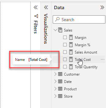
Before running the script hovering over a measure in my data model only shows the measure name
the default tooltip showing just the measure name
After running the script, you get a much more informative tooltip
the expanded tooltip showing the new auto-populated description
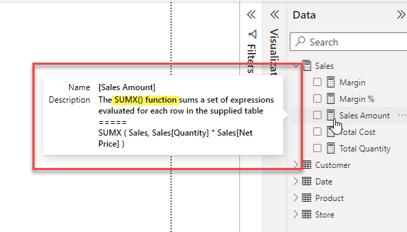
Interestingly the descriptions do seem to change a little bit from one run to the next and in spite of asking it not to use DAX function names in the description sometimes it still sneaks one in. The description below was particularly bad where it just described the SUMX function.
But the advantage of this technique is that you can re-run it for single measures if you like or you could manually edit the description field if the description needed a small improvement.
Update: 16 Feb 2023 – added note about API rate limiting
Update: 17 Feb 2023 – See part-2 here for short tutorials on how to run the script and an updated version which deals with the API rate limiting
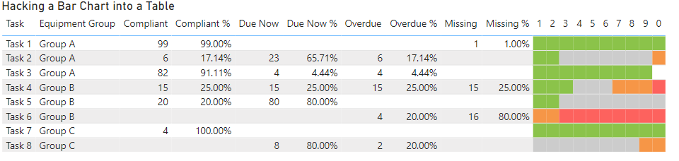
I was working on report with a business user and one of the outputs he wanted to see was a list of over 100 tasks that needed to be performed on specified groups of equipment.
One of the initial views they wanted to see is list of these tasks with about 7-8 descriptive columns so a table visual made the most sense. However, for each of those tasks there would be 1 or more pieces of equipment and for each piece of equipment it could be in 1 of 4 states depending on the last time the task was performed.
The states that a piece of equipment could be in are:
Compliant (the task was performed before the due date)
Due Now (the due date has passed, but each task has a certain amount of tolerance and we are within that tolerance)
Overdue (the task is past the due date and tolerance)
Missing (cannot find any historic occurrence of this task)
The above information is just for some context, but they key take away is that we had a table and 4 percentages that added up to 100% across each row.
The problem was that the information was very text heavy and it was difficult to see which tasks were OK and which ones needed attention without reading each row carefully one at a time. I initially tried adding some conditional formatting of the background colours and that helped a little bit, but it still was not clear.
What would have been really nice was to use a 100% stacked bar chart, but we had too many descriptive columns to use one of these visuals on its own and we had too many rows to be able to just position one next to the table.
If you are interested in seeing an implementation of each of the approaches outlined below a copy of the PBIX file I used for the images in this blog post will be linked at the end of this post
Approach 1: Using an SVG Measure
What would have been ideal would be to use a measure to generate an SVG image. There are a number of blog posts available that show how you can generate SVG strings in DAX. Unfortunately due to the limitation that all images in tables and matrices are forced to be square and you cannot specify a rectangle that is wider than it is high.
If you would like to see the limitation removed that forces images to have the same width and height please vote for this idea
I did do a quick test to confirm that this restriction was an issue and it produced output like the following which was no good as it forced each row to be too tall.
At this point I reached out to some friends to see if anyone else had some ideas for solving this issue or whether I would need to consider a different design for the report. This ended up in a great 3-way conversation between myself, Daniel Marsh-Patrick ( b | t ) and Kerry Kolosko ( b | t )
Approach 2: Using a Measure with extended unicode characters
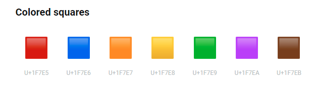
After explaining the issue and what approaches I had already considered Daniel quickly came up with the idea of using extended unicode characters to approximate a bar chart. If you scroll down to the bottom of this page which shows some of the extended unicode characters you can see that there are some characters which are colored squares.
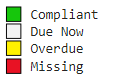
There are only 7 different colours (and a black and white square) but that is enough to build a simple bar chart.
Using the following measure we are able to generate a series of coloured squares to represent each of our percentages. (note you should see different coloured squares in the code below, if you don’t keep reading for an explanation of this)
Unicode Chart =
    VAR purple = "🟪"
    VAR brown  = "🟫"
    VAR green  = "🟩"
    VAR red    = "🟥"
    VAR orange = "🟧"
    VAR yellow = "🟨"
    VAR blue   = "🟦"
    VAR white  = "⬜"
    VAR black  = "⬛"
    VAR Scale = 10
    VAR Compliant = COALESCE(MROUND([Compliant %], (1/Scale)) * Scale,0)
    VAR DueNow = COALESCE(MROUND([Due Now %], (1/Scale)) * Scale, 0)
    VAR Overdue = COALESCE(MROUND([Overdue %], (1/Scale)) * Scale, 0)
    VAR Missing = COALESCE(MROUND([Missing %], (1/Scale)) * Scale, 0)
    RETURN
        IF (HASONEVALUE('Tasks'[Task]),
                REPT(green, Compliant) &
                REPT(white, DueNow) &
                REPT(yellow, Overdue) &
                REPT(red, Missing)
                , BLANK()
                )
I selected a scale value of 10 which builds a simplistic bar chart where each square represents 10%. I This chart uses the following colour coding
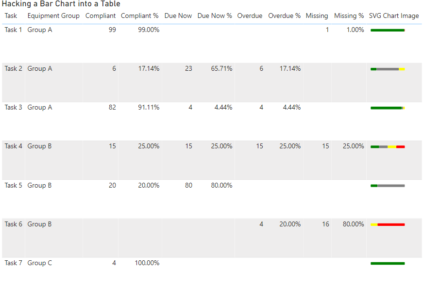
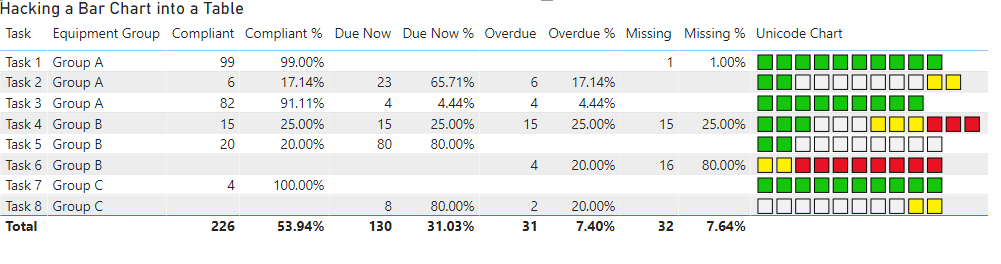
And this produces a result like the following, which is really cool since all of the logic is contained in a single measure:
Unicode bar chart
However, you will notice that there are a couple of issues with the bar charts above. This is because I have specifically chosen the amounts I used in the test data to highlight some of the problems with this sort of approach.
Task 1: appears to be 100% compliant, but is actually only 99%
Task 2: has 11 squares due to multiple categories being rounded up
Task 3: has only 9 squares due to multiple categories being rounded down
Task 4: has 12 squares due to multiple categories being rounded up
In my specific circumstance, since the goal is to get every task to a status of 100% compliant, the issue with Task 1 was actually the most critical. I did not want something to appear to be 100% compliant if it was not actually at 100%. While annoying from an esthetics point of view the issue of there not always being exactly 10 squares was not a deal breaker.
However we did find one deal breaker with this approach and that is that it appears as follows on some machines, with just a series of white squares on every row:
I think this is probably because Power BI uses the fonts from the client machines when rendering text. So maybe there were different versions of the standard fonts. But even on some machines supposedly running the identical version of Windows 10 we still saw instances of this issue. This is pretty much a deal breaker for this approach as there was no way to guarantee that the necessary extended characters would be available on all the client machines.
Approach 3: A creative use of conditional formatting
It was at this point that Kerry came up with the inspired suggestion of creating 10 columns and using conditional background colours to simulate the bar chart.
I started off by creating the first measure using the following expression.
Status 01 =
var block = 1   // the number of the current block
var scale = 10  // controls the number of blocks
var comp =   MROUND([Compliant %],(1/ scale)) * scale
var dueNow =  comp + (MROUND([Due Now %],1/ scale) * scale)
var overdue =  dueNow + (MROUND([Overdue %],1/ scale) * scale)
var missing =  overdue + (MROUND([Missing %],1/ scale) * scale)
var result = SWITCH(TRUE(),
    comp >= block , 1,
    dueNow >= block , 2,
    overdue >= block , 3,
    missing >= block , 4,
    blank()
)
return result
I setup all the key components as variables so then I just had to copy paste the code 9 more times just changing the name and the value of the “block” variable. (you can see these 10 measures in the report linked at the bottom of this post)
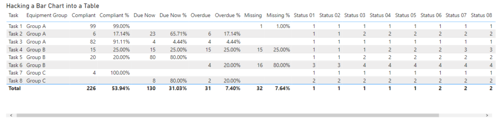
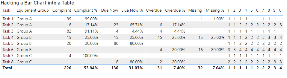
If you drop these 10 measures into a table you get output like the following:
By renaming each of the measures so they are just a single digit from 1 to 0 we can shrink down the table so that it easily fits on the page without horizontal scroll bars
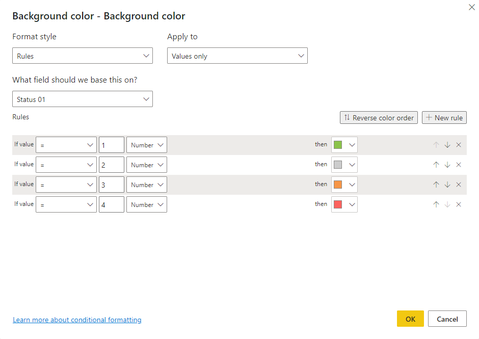
In my first pass I started off creating rules for the background colour. This involved creating 4 rules, one for each colour and doing this 10 times (once for each column). You can see the rules for column 1 below.
After doing a couple of columns this got a bit tedious. The technique was working, but it was taking a lot of clicks per column which made me wonder if there was a better way. But you can see from the image below how the rules were working.
If you look at the options for the conditional formatting instead of using a rules based approach you could use the value coming from a column or measure. So I created 10 measures like the following which returned the background colour as a hex string instead of returning a numeric value between 1-4 that I could use in the rules.
Status Colour 01 =
var block = 1
var scale = 10
var compliant =   MROUND([Compliant %],(1/ scale)) * scale
var dueNow =  compliant + (MROUND([Due Now %],1/ scale) * scale)
var overdue =  dueNow + (MROUND([Overdue %],1/ scale) * scale)
var missing =  overdue + (MROUND([Missing %],1/ scale) * scale)
var compliantColour = "#8BC34A"
var dueNowColour = "#CCCCCC"
var overdueColour = "#F69647"
var missingColour = "#FD625E"
var result = SWITCH(TRUE(),
    compliant >= block , compliantColour,
    dueNow >= block , dueNowColour,
    overdue >= block , overdueColour,
    missing >= block , missingColour,
    blank()
)
return result
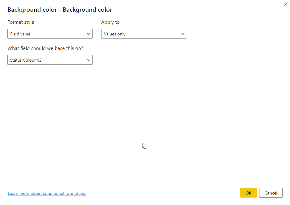
This meant I could change the conditional formatting settings to look as follows which just required me to change the Format Style to “Field value” and then pick the relevant measure.
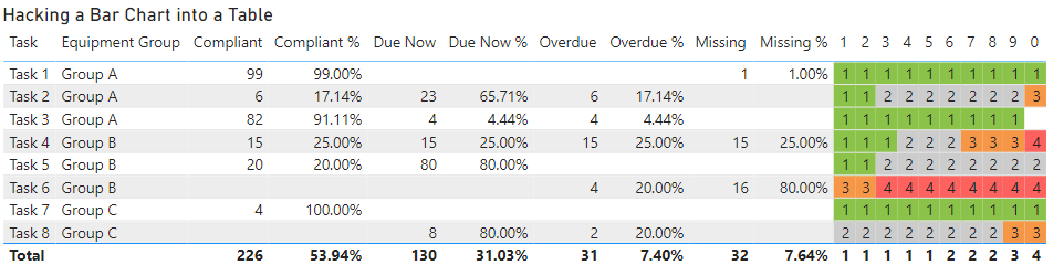
This was a much simpler approach which took much less time to configure and once I configured both the background and foreground colours it resulted in an output like the following.
The only remaining issue was the 1-0 column headings, but I “fixed” that by positioning a text box with a white background over the top of these.
What about other options like Charticulator or the HTML Content custom visual?
I’m sure there are many of you wondering if this approach of hacking a table was the best option and what other approaches might have worked. Below are some of the other options which I considered and subsequently chose not to pursue.
Create a Custom Visual – I have dabbled a bit with coding custom visuals and I could have potentially built my own, but it would have taken days and days to do this not hours. And then there is the requirement to maintain and update the custom visual over time which adds extra burdens to this approach which makes it unfeasible for visuals with a limited re-use potential
Charticulator – I have not used this very much so there may be an approach I missed (and I’m more than happy to be proven wrong if someone wants to have a go at implementing this). But from what I could see there is no way to force the individual text glyphs to be constrained to a given column size so if some of the description fields were longer than the available space they would overlap with the next “column” instead of wrapping like they do with a table.
HTML Content Visual – I actually got really close to the original concept for this report with the HTML Content Visual, but one key bit of functionality that I needed to support was the ability to drill through from the table to a detail page. Unfortunately the HTML Content Visual does not currently support any way of configuring drillthrough.
Download the sample file
If you are interested to play with the example file used in this post you can get it from here
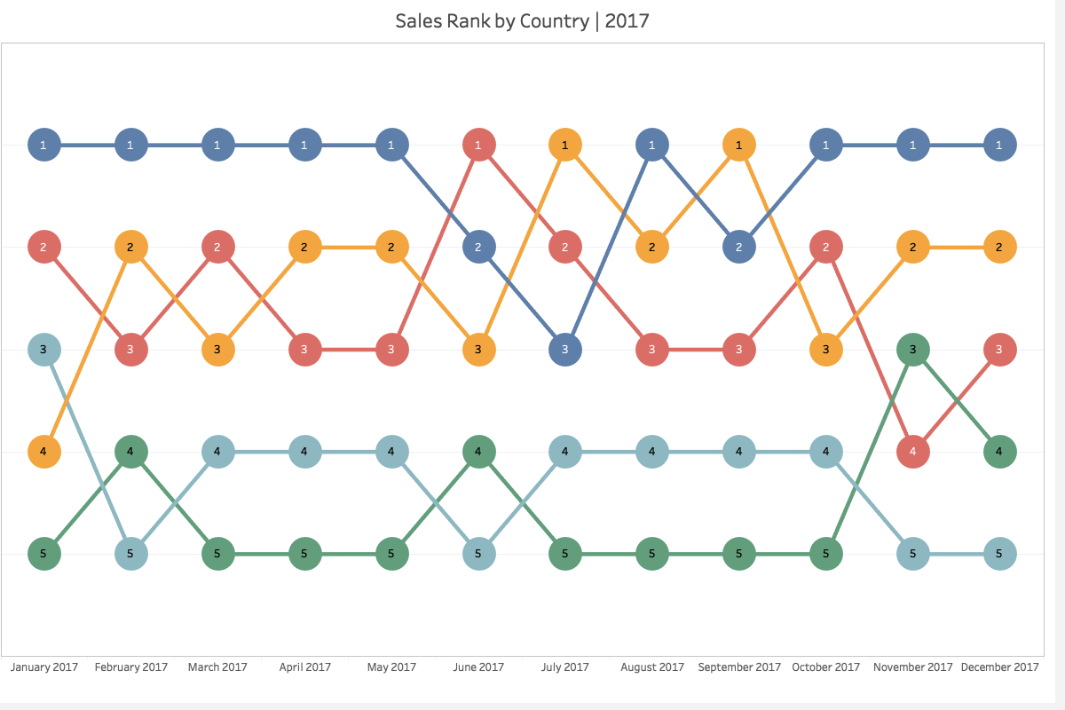
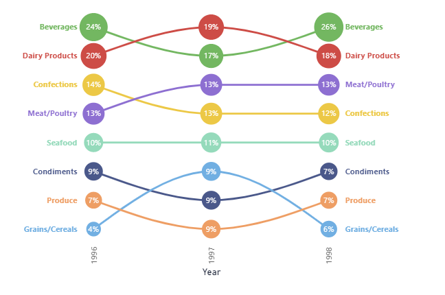
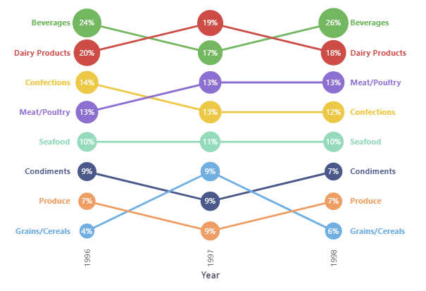
Bump charts / Slope charts are an interesting way to show changes in rankings over time, but Power BI does not currently have a good built-in chart for this sort of visualization.
Example of a bump chart
I saw an interesting example of one of these charts recently where the circles in the bump chart also change size based on the relative value of the metric.
There is a video on the Curbal channel showing how you can get pretty close with a line chart, but the circles are all the same size.
And Kerry Kolosko also has an example using deneb on her site. And while the circles are a constant size in her example, I was pretty sure that with a little tweaking I could make Deneb produce the sort of output I wanted.
I started using a copy of the data set from Curbal’s video. I used the existing [Rank bump chart] measure for the rankings and I created a simple Percent of Year measure using the following expression for the labels and sizing of the circles.
Percent of Year = DIVIDE([Sales], CALCULATE([Sales] , all(), values('Calendar'[Year])))
And after a bit of experimenting and reading through the Vega and Vega-Lite documentation to figure out how to specify the size encoding for the circles I ended up with the following result which I was pretty pleased with.
Final Bump Chart
Below is the Deneb specification for the above chart
If you prefer the look of the straight lines between the data points you can simply remove the "interpolate": "monotone" from the lines layer and you end up with a chart like the following one.
Field Parameters are a relatively new feature in Power BI which are still in preview and they add a lot of flexibility to an interactive reporting solution, but can they be used in paginated reports?
The short answer is yes, but the experience is not as simple as it is in Power BI Desktop. The reason for this is that Power BI Desktop does not just pass field parameters as filters to other visuals, they actually change the way the underlying DAX queries are generated.
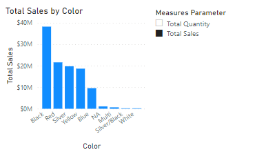
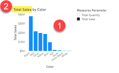
The following example of an Adventure Works based report with a field parameter that allows the user to choose between showing either the Total Sales measure or the Total Quantity measure.
If we use the Performance Analyzer in Power BI Desktop to capture all the queries for this page we find 2 sets of queries.
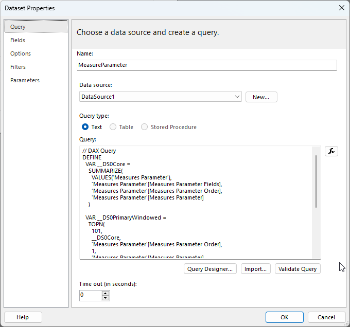
The first one for the slicer looks as follows and just gets a list of values from our Field parameter table:
To start integrating our Field Parameters into our paginated report we can create a new paginated report using Power BI Report Builder and we can copy and paste this query into a new dataset. I’ve called this dataset “MeasureParameter” in the screenshot below:
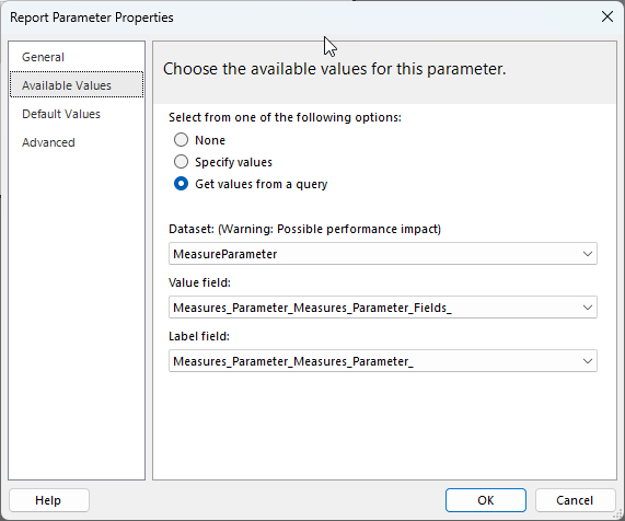
We can then create a new report Parameter linked to this dataset. I’ve called my parameter “MeasureName” and I’ve linked up the available values as follows:
Note that I’m using the field for the Value property which returns the full DAX reference for the measure (eg. ‘Sales'[Total Sales]) and I’m using the display name of the measure for the label field (eg. “Total Sales”)
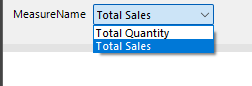
This will generate a parameter like the following when the paginated report is run to allow the user to select which measure to use:
If we then look at the second set of queries in the Performance Analyzer, we can see that the there are actually 2 queries.
Gets the data for the chart and this query is dynamically generated
Gets the name of the currently selected Field Parameter which is used to populate the chart title and axis labels
We can ignore query 2 as we already have the information about the field parameters in our MeasureParameters dataset, but how do we dynamically generate our query in the same way that Power BI does?
The answer to this is using expressions. Paginated Reports are extremely powerful in this regard and almost all of the properties of the objects in a report can set using expressions – even the query text and that is what we are going to do in this case.
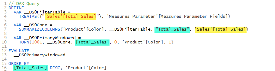
If we look at the text of the first query we captured from Performance Analyzer, it looks as follows:
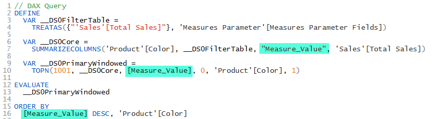
Where you can see on lines 4 and 7 that the ‘Sales'[Total Sales] measure is referenced (which I’ve highlighted in yellow. And on lines 7, 10 and 16 that this is given a name of [Total_Sales] in the output from the query. The [Total_Sales] is just a column name in the results of the query and we could leave it as end users of our report will not see this reference, but I prefer to make it clear that this is may not always be the Sales measure, so I renamed it to [Measure_Value]
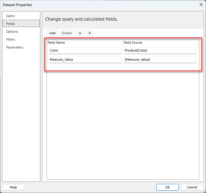
Then I created a new Dataset called “Dataset1” and pasted the above static query in and clicked “OK” this saves our dataset and generates the field mappings for us. (you can manually create the field mappings from the resultset to the paginated dataset, but I find this method of starting with a static query easier)
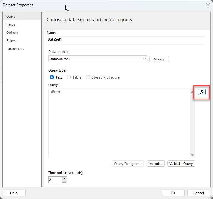
Then to make this query dynamic I clicked the “fx” button next to the Query property to open the expression editor.
I then made the following changes to the query text:
First, I started the expression with an = sign, this tells the report engine that this value needs to be evaluated as an expression. Then I added a double quote character as this is the start of a string expression.
Then I added a closing double quote character at the end of the query.
I then went through the rest of the query and doubled up any existing double quote characters to escape them.
Finally, I inserted some concatenation expressions to add in the Value property from our MeasureName parameter which we added earlier using the Parameters!MeasureName.Value reference.
So, we now have a dynamic query which will inject the measure to be used based on the parameter chosen by the user at run time.
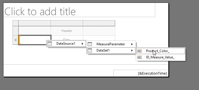
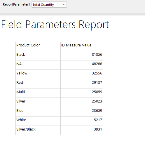
To test this we can put a simple table on our report canvas and link up the Color and Measure value fields
This gives us a table which looks like the following
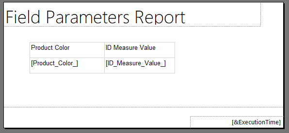
And when we run it and choose a measure from the parameter we get the data we expect, but we cannot easily tell from the report which measure was selected by the user since the column header just says “ID Measure Value”. So if this report was exported to a PDF or sent as part of an emails subscription it might be hard to tell which measure was selected.
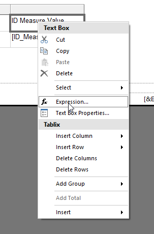
To fix this we can right click on the “ID Measure Value” header and turn this column header into an expression instead of being static text.
Then we can use an expression like the following to use the label of the selected parameter value as column header
=Parameters!MeasureName.Label
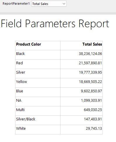
If we also bold the column headers, now when we run our report, we get an experience almost identical to that in Power BI Desktop and our table now shows which measure was selected in the header for the measure column.
This same technique of using an expression-based query could be adapted to work with field parameters that reference columns instead of measures. The expression for the query would just need to be adjusted differently, but I will leave this as an exercise for the reader.
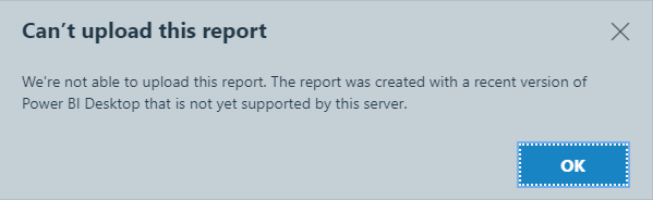
A little while ago at my previous job we had a new user report an issue where they could not upload a Power BI Report to our Report Server and I found a simple fix which I thought was worth sharing.
In this case they were getting the error that the report was created with a recent version of Power BI Desktop that is not yet supported by this server.
So, how did this happen…
When you are running Power BI Report Server it is really important that your report authors use the Report Server version of Power BI Desktop that matches the release of your Server.
If you are not already aware there are actually 3 different distributions of Power BI Desktop
The Windows Store version
The Standalone installer version
The Power BI Report Server version
If you are running an on-prem Power BI Report Server, it is vital that you use the Report Server version of Power BI Desktop. Failing do so can mean that you may spend hours building a report that will not run on the server.
If you are not sure where to get this the Report Server Portal has a download link in the top right corner with a link (provided you are running one of the supported releases of Report Server, once the server goes out of support the downloads for Desktop are removed)
On my machine I have both the Microsoft Store version of desktop and the Report Server version. You can tell the difference because the Report Server version has a little black “RS” on the logo and the application title always includes the release month.
What had happened with this user was that someone had sent them a pbix file to work on. Being new to the organization they just downloaded the Microsoft Store version of Power BI Desktop, did their updates to the file and then tried to upload it to Power BI Report Server and this is when they got this error.
The problem is that now the file will not open in the Report Server version of Power BI Desktop since the file format has been updated to work with the newer version of Desktop from the Store.
Fix 1 – Manually rebuild the report
If your report is small and you realize this early, maybe just re-creating the report is an option, but often you do not realise this mistake until you have invested a significant amount of time in your report.
Fix 2 – Copy/Paste
One way to “fix” this is to run both the “Store” version of Desktop and the “Report Server” version of Desktop. Then open the file in the “Store” version of Desktop and manually copy the Power Query text from the Advanced editor, then copy measures and any calculated columns and tables, then copy visuals from one report to the other. As long as you have not used any new functionality that does not exist in Report Server this can work fine and is less work than a full manual re-build.
Fix 3 – Create a template file
This is the simplest option if it works.
All I did was to open the report in the “Store” version, did a “save as” and changed the type to a Power BI Template file. Then the user was able to open the resulting pbit file in the “Report Server” version of Desktop. Then I could refresh the data and upload it to Report Server.
This probably only works if you have not used functionality that only exists in the cloud service, but if you are using the lastest release of Report Server this number of things in this category should be relatively small. If you can identify any items like this, you may be able to remove them from your report before creating the template file.
I know it’s been a while since I’ve released an update to DAX Studio. But I’m happy to announce that version 3.0 is now available with a major update to the User Interface including the option for a Dark theme. You can download it from https://daxstudio.org (which has also had a major update and can be viewed in Dark mode) and you can read about what’s new in this release here: v3 Release | DAX Studio
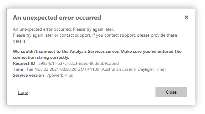
Earlier this week we started getting reports of the following error on our production Power BI Report Server (PBIRS) instance for any reports that were using a live connection back to one of our Analysis Services models.
All it basically said was “an unexpected error occurred. Please try again later”. And if you looked at the details it showed the message above saying that “We could not connect to the Analysis Services server”.
Some other fun facts about this issue are:
It was not affecting all users (at least in our environment)
There had been no recent updates or configuration changes on PBIRS, SQL or SSAS
The same issue appeared to be affecting our test environment but not our development environment.
It was happening for both pbix and paginated reports
It was affecting reports that sourced data from SQL Server as well as SSAS
When running a profiler trace against SSAS listening for the session events I could see some sessions with usernames and others where the user was listed as “ANONYMOUS USER”
Putting all of the above evidence together point to some sort of Kerberos issue. In our environment our SQL and SSAS instances are on different servers to our PBIRS instance we had to configure Kerberos with constrained delegation to allow for the user credentials to flow from client > to PBIRS > to SSAS.
Kerberos can be a little fiddly to setup initially, but once it’s configured I’ve never had an issue with it until the one this week. When we initially configured Kerberos I had distilled the generic instructions from the Microsoft documentation down into a series of specific steps for our production environment listing the specific setspn commands that needed to be run and how the constrained delegation settings needed to be configured and saved these in a document. This made it very easy to cross check that all these configurations were still correct.
At this point we knew that the Kerberos configuration appeared to be unchanged, but we still had an issue where it worked for some users and not for others.
So the next thing I started doing was to get some of our users to run the klist command from a command prompt. This command lists all the Kerberos tickets that are cached on the current machine. This lead us to find a pattern where everyone that was getting the error were getting their kerberos tickets from a specific list of domain controllers while people that did not have the issue were getting theirs from a different list of domain controllers. Our IT admins then noticed that all the failing servers were in a group which had had security patches applied earlier that day.
The specific patch that had been applied was KB5007206 and after raising a support ticket with Microsoft they were able to point us to the following hotfix (KB5008602) for this update which fixed an issue when you were using Kerberos authentication with constrained delegation and protocol transition (which is exactly how Kerberos needs to be configured when using PBIRS or SSRS or SSRS in Sharepoint integrated mode for people with on-prem Sharepoint environments).
Hopefully this post will help anyone else that runs into this issue.
Recent Comments