I’ve just released v3.3 of DAX Studio. The list of updates and fixes is available here v3.3.0 Release | DAX Studio
Author: Darren Gosbell (Page 1 of 5)
At the time of writing this post there is no built-in support for creating dynamic per recipient subscriptions for paginated reports if your report has any multi-value parameters. But there is a simple workaround that should enable you to set this up with minimal extra overhead.
Overview
The basic idea is to create a report just for your dynamic subscriptions that has a simple text parameter which you can then split based on some delimiter to pass to your “main” report.
The problem
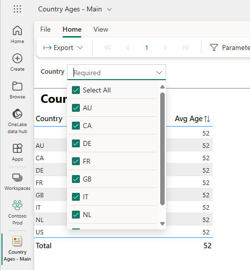
To test this, I created a simple report using some Contoso data which has a list of country codes and the average customer age in each country. The actual data is not important, but the fact that I have a required multi-value parameter means that when you try to create a dynamic subscription it will throw an error when the subscription runs. I’ll refer to this as the “main” report.
This is what the parameter for my “main” report looks like
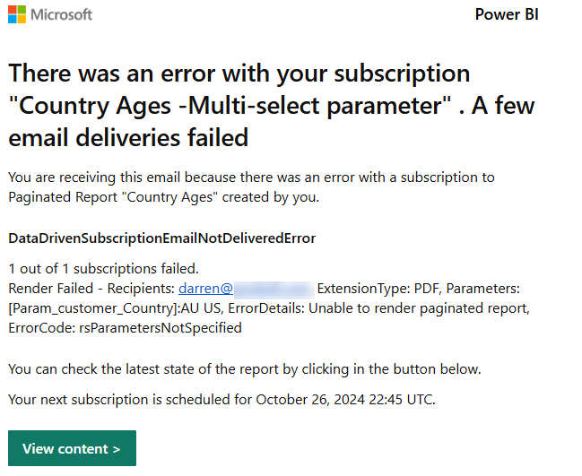
This is the sort of error that the subscription owner will see if you try to pass multiple values to the Country parameter:
The solution
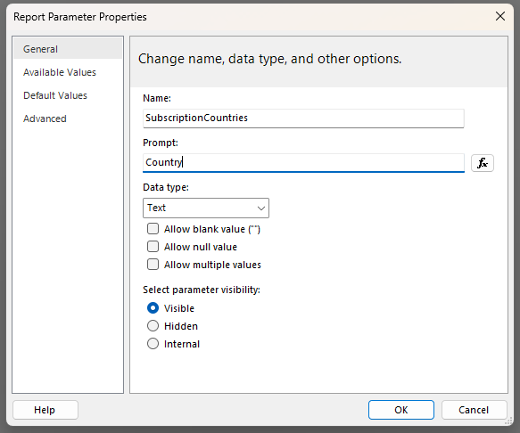
To work around this issue, I created a second report, which we will call the “subscription” report. I then created a local parameter which I called “SubscriptionCountries” so that I would know that this is the parameter in the “subscription” version of the report. You need to create one parameter in this report for each of the parameters in your “main” report.
Even though the Country parameter in the “main” report has the “Allow multiple values” option checked I did not select this in the “subscription” report and left it as a plain text parameter – this is the key to getting the subscription to work
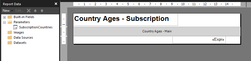
I then inserted a subreport and removed all the surrounding whitespace. I also made sure to configure the width of this report to be the same as the “main” version of the report. Then I configured the properties of this subreport to use the “main” version of the report.
I also had to setup the header and footer in the “subscription” report since subreports only render the body area of the report.
The next step was to configure the parameter properties for the subreport. For any parameters that are not multi-select you can just map these directly to the subscription version of the parameter. But for any multi-value parameters the trick is to set these using an expression.
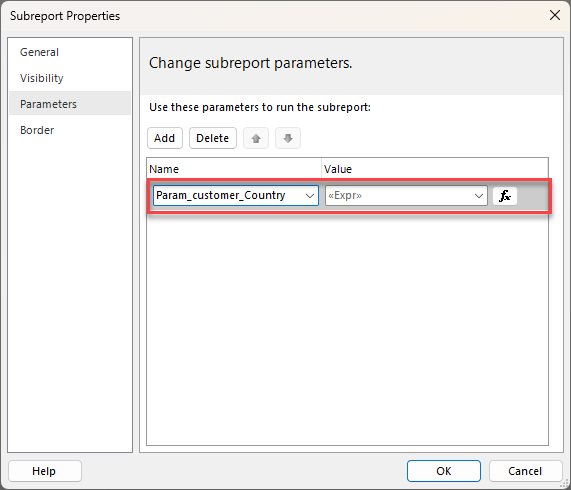
In my case I chose to pass the multiple values as a comma separated string, using the following expression, but if you wanted to use a different parameter like a semi-colon or pipe character you could do that.
=Split(Parameters!SubscriptionCountries.Value,",")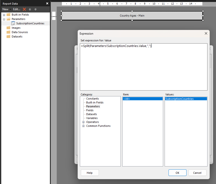
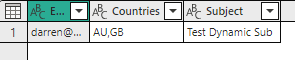
The rest is simple, I just created a semantic model that contained the multiple values as a comma separated string and then configured my dynamic per recipient subscription to use that value
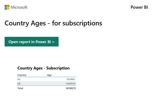
Then when the subscription ran, I received the following email in my inbox
Conclusion
While it would be nicer if dynamic subscriptions had native support for multi-valued parameters at least this technique should unblock you with minimal extra work.
To keep your workspace “cleaner” I would suggest putting these special subscription versions of the reports in their own folder in your workspace.
I am happy to announce that v3.1.0 of DAX Studio has just been released. There are a number of new features in this release including a brand new command line which will allow for the automation of common tasks. Be sure to read through the details of all the new and updated features here: v3.1.0 Release | DAX Studio
I recently wrote about a technique for calling a Power BI REST API from a Fabric notebook and I got a question about how to take that data and persist it out to a delta table which I thought would make a good follow-up post.
In my last post I use SPN authentication, this time we are going to use the function mssparkutils.credentials.getToken() to get the authentication token for owner of the notebook.
NOTE: I’m still learning python and spark, so this may not be the best way of doing things, I’m just sharing what’s worked for me. Feel free to drop a comment if you see any areas that can be improved.
If you just want to see the full code listing without the explanations between the sections you can find it at the end of this post.
Extracting data from a REST API
from pyspark.sql.functions import *
import requests, os, datetime
from delta.tables import *

############################################################
# Authentication - Using owner authentication
############################################################

access_token = mssparkutils.credentials.getToken("https://analysis.windows.net/powerbi/api")

print('Successfully authenticated.')

############################################################
# Get Refreshables
############################################################

base_url = 'https://api.powerbi.com/v1.0/myorg/'
header = {'Authorization': f'Bearer {access_token}'}

refreshables_url = "admin/capacities/refreshables?$top=200"

refreshables_response = requests.get(base_url + refreshables_url, headers=header)

# write raw data to a json file
requestDate = datetime.datetime.now()
outputFilePath = "//lakehouse/default/Files/refreshables/top_200_{year}{month}{day}.json".format(year = requestDate.strftime("%Y"), month= requestDate.strftime("%m"), day=requestDate.strftime("%d"))

if not os.path.exists(os.path.dirname(outputFilePath)):
    print("creating folder: " + os.path.dirname(outputFilePath))
    os.makedirs(os.path.dirname(outputFilePath), exist_ok=True)

with open(outputFilePath, 'wb') as f:
    f.write(refreshables_response.content)
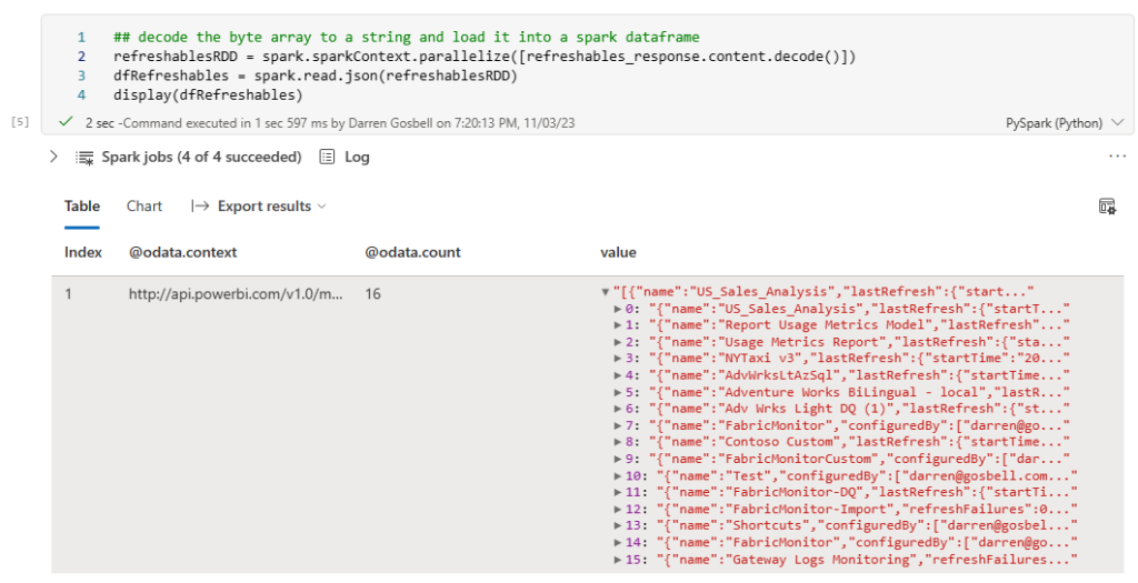
To this point we have executed a call against the REST API and we have a response object in the refreshables_response variable. And then we’ve written the content property of that response out to a file using a binary write since the content property contains a byte array. What we want to do now is to read that byte array into a spark dataframe so that we can write it out to a table.
Converting a string to a dataframe
Spark does have a method which can read a json file into a spark dataframe, but it seems a bit silly to do that extra IO of reading the file off disk when I still have the data from that file in a variable in memory. You can do this by wrapping the string from the response content in a calling to the parallelize() method then wrapping that in a call to spark.read.json()
refreshablesRDD = spark.sparkContext.parallelize([refreshables_response.content.decode()])<br>dfRefreshables = spark.read.json(refreshablesRDD)
Transforming our dataframe to a flat table
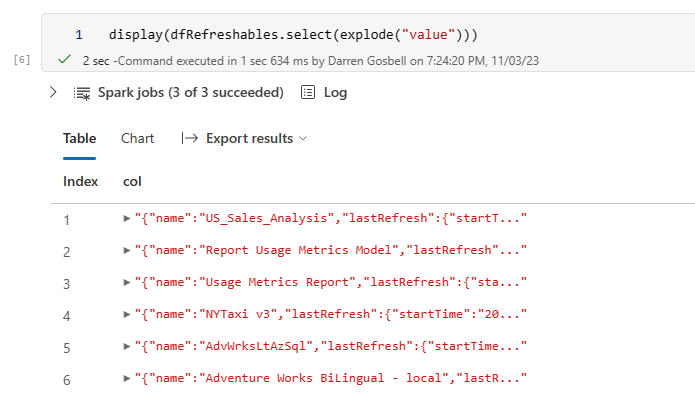
We are almost there, however if you use the display() method to have a look at the results you will see that the dataframe only has a single row with a value column that has an array in it.
But ideally what we would like is a table with a row for each element in the array, not just a single row with the array in a column. To do this we can select from the dataframe and call the explode() method on the value column
This is looking a bit better, but now we have a nested object inside a column called col and what I really want is to break each of the properties from those objects out into separate columns. And we can do that by added a .select(“col.*”) on the end of our exploded select.

That has successfully split out every property into its own column. If you want to get a subset of columns or list the columns in a certain order you can just reference them by name using a syntax like the following:
dfRefreshables = dfRefreshables.select(explode("value")) \
    .select("col.id",
        "col.startTime",
        "col.endTime",
        "col.medianDuration",
        "col.averageDuration",
        "col.lastRefresh.status",
        "col.lastRefresh.refreshType")
Writing a dataframe to a delta table
Now that I have a dataframe in the exact format that I want it is trivial to write this out to a delta table in my lakehouse by calling the .write() method on the dataframe
dfRefreshables.write.mode('overwrite').format("delta").saveAsTable("refreshables")
Merging the data into an existing table
If all you want to do is to overwrite the data in your table each time you run your notebook then you can stop at this point. But what if you are doing an incremental load and you want to insert new records if they don’t already exist or update a record if the id is already in the table. In this case you can use the following code:
 if spark.catalog.tableExists("refreshables"):
        #get existing table
        targetTable = DeltaTable.forName(spark,"refreshables")
        #merge into table
        (targetTable.alias("t")
            .merge(dfRefreshables.alias("s"), "s.Id = t.Id")
            .whenMatchedUpdateAll()
            .whenNotMatchedInsertAll()
            .execute()
        )
else:
    # create workspace table
    dfRefreshables.write.mode('overwrite').format("delta").saveAsTable("refreshables")
This code will check if the table already exists, if it doesn’t it uses the write method to create a new table. But if the table does exist, we then use the merge method to do an upsert operation.
The full code sample
The section below contains all of the code snippets from the above as a single block that you can paste into a cell in a Fabric notebook. When you run this it should:
- Query the Power BI get Refreshables API.
- Store the raw output in a json file in the Files portion of the attached lakehouse.
- Write out this data to a delta table in the lakehouse.
 from pyspark.sql.functions import *
import requests, os, datetime
from delta.tables import *

#########################################################################################
# Authentication - Using owner authentication
#########################################################################################

access_token = mssparkutils.credentials.getToken("https://analysis.windows.net/powerbi/api")

print('\nSuccessfully authenticated.')

#########################################################################################
# Get Refreshables
#########################################################################################

base_url = 'https://api.powerbi.com/v1.0/myorg/'
header = {'Authorization': f'Bearer {access_token}'}

refreshables_url = "admin/capacities/refreshables?$top=200"

refreshables_response = requests.get(base_url + refreshables_url, headers=header)

# write raw data to a json file
requestDate = datetime.datetime.now()
outputFilePath = "//lakehouse/default/Files/refreshables/top_200_{year}{month}{day}.json".format(year = requestDate.strftime("%Y"), month= requestDate.strftime("%m"), day=requestDate.strftime("%d"))

if not os.path.exists(os.path.dirname(outputFilePath)):
    print("creating folder: " + os.path.dirname(outputFilePath))
    os.makedirs(os.path.dirname(outputFilePath), exist_ok=True)

with open(outputFilePath, 'wb') as f:
    f.write(refreshables_response.content)

refreshablesRDD = spark.sparkContext.parallelize([refreshables_response.content.decode()])
dfRefreshables = spark.read.json(refreshablesRDD)

dfRefreshables = dfRefreshables.select(explode("value")) \
    .select("col.id",
        "col.startTime",
        "col.endTime",
        "col.medianDuration",
        "col.averageDuration",
        "col.lastRefresh.status",
        "col.lastRefresh.refreshType")

## write the spark dataframe out to a delta table
if spark.catalog.tableExists("refreshables"):
        #get existing table
        targetTable = DeltaTable.forName(spark,"refreshables")
        #merge into table
        (targetTable.alias("t")
            .merge(dfRefreshables.alias("s"), "s.Id = t.Id")
            .whenMatchedUpdateAll()
            .whenNotMatchedInsertAll()
            .execute()
        )
else:
    # create workspace table
    dfRefreshables.write.mode('overwrite').format("delta").saveAsTable("refreshables")
Sometimes when you have a slow paginated report it’s hard to know where to start in order to improve the performance.
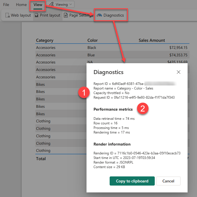
There is a feature in Paginated Reports on the Power BI service that was released a number of months ago which will show you a breakdown of the performance of that report.
After you have run your report you can access this feature by going into the View menu and clicking on the Diagnostics button
Power BI Report Server and SQL Server Reporting Services do not have this button on the report itself, but you can get the same timing information by querying the ExecutionLog3 view in the ReportServer database (see Report Server ExecutionLog and the ExecutionLog3 View – SQL Server Reporting Services (SSRS) | Microsoft Learn)
This dialog shows us a number of pieces of interesting information about the report execution.
- Note the item at the top here which says “Capacity throttled = no” this applies to premium capacities and tells you if the capacity is currently in a throttled state. This is important as throttling adds a delay to interactive operations like report rendering and so your report may have slow performance because previous operations on the capacity have put it into a throttled state.
- This second section of the report shows you a breakdown of the different category of operations in the report as well as a count of the total dataset rows that were processed.
If you want to understand what is happening during each step of the performance metrics, I found the following information in this archived blog post from a former member of the SSRS team which breaks down the operations which go into each of these 3 categories.
Data Retrieval Time
The number of milliseconds spent interacting with data sources and data extensions for all data sets in the main report and all of its subreports. This value includes:
- Time spent opening connections to the data source
- Time spent reading data rows from the data extension
Note: If a report has multiple data sources/data sets that can be executed in parallel, TimeDataRetrieval contains the duration of the longest DataSet, not the sum of all DataSets durations. If DataSets are executed sequentially, TimeDataRetrieval contains the sum of all DataSet durations.
Processing Time
The number of milliseconds spent in the processing engine for the request. This value includes:
- Report processing bootstrap time
- Tablix processing time (e.g. grouping, sorting, filtering, aggregations, subreport processing), but excludes on-demand expression evaluations (e.g. TextBox.Value, Style.*)
- ProcessingScalabilityTime**
Rendering Time
The number of milliseconds spent after the Rendering Object Model is exposed to the rendering extension. This value includes:
- Time spent in renderer
- Time spent in pagination modules
- Time spent in on-demand expression evaluations (e.g. TextBox.Value, Style.*). This is different from prior releases, where TimeProcessing included all expression evaluation.
- PaginationScalabilityTime**
- RenderingScalabilityTime**
** The “scalability” times are when the engine does extra operations to free up memory in response to memory pressure issues during processing, pagination or rendering
Optimizing Report Performance
If you are interested in ways to optimize the performance of a paginated report, then many of the techniques outlined in this old article are still perfectly valid even though it was written for SQL 2008R2 – you can just ignore some of the points that are specific to on-prem scenarios like point 2 using Shared Data Sources which are not available in the Power BI service.
The introduction of Microsoft Fabric at the Build Conference last month has added a whole lot of new functionality that you can use. One of the new items we now have access to is a simple way of running Notebooks. And these Notebooks open up all sorts of interesting options for Data engineering, exploration and ingestion.
One of the things that this makes possible is to call a Power BI REST API and save the results into the Files section of a Fabric Lakehouse.
So lets look at an example of that calling the Get Refreshables API.
Setup
There are a couple of setup steps before you can run the script below.
Firstly, I’ve actually followed best practices here and used Azure Key Vault to secure all the secrets for my script rather than just hard coding them. I’ve added the following 3 secrets to my key vault:
- FabricTenantId – my Power BI tenant ID
- FabricClientId – the client ID for an SPN that I created to run this script
- FabricClientSecret – the client secret for the SPN
I then gave my user access to read those secrets and because the notebook uses the identity of the owner when it executes this also works even when your setup a schedule for your notebook.
If you don’t have access to a key vault you could just hard code your values into this notebook.
Then I’ve created a Lakehouse in my workspace and created a refreshables folder under Files.
Once all that is done you can paste the following script into a new notebook and run it.
#########################################################################################
# Read secretes from Azure Key Vault
#########################################################################################
key_vault = "https://dgosbellKeyVault.vault.azure.net/"
tenant = mssparkutils.credentials.getSecret(key_vault , "FabricTenantId")
client = mssparkutils.credentials.getSecret(key_vault , "FabricClientId")
client_secret = mssparkutils.credentials.getSecret(key_vault , "FabricClientSecret")
#########################################################################################
# Authentication - Replace string variables with your relevant values
#########################################################################################
import json, requests, pandas as pd
import datetime
try:
from azure.identity import ClientSecretCredential
except Exception:
!pip install azure.identity
from azure.identity import ClientSecretCredential
# Generates the access token for the Service Principal
api = 'https://analysis.windows.net/powerbi/api/.default'
auth = ClientSecretCredential(authority = 'https://login.microsoftonline.com/',
tenant_id = tenant,
client_id = client,
client_secret = client_secret)
access_token = auth.get_token(api)
access_token = access_token.token
print('\nSuccessfully authenticated.')
#########################################################################################
# Get Refreshables
#########################################################################################
base_url = 'https://api.powerbi.com/v1.0/myorg/'
header = {'Authorization': f'Bearer {access_token}'}
refreshables_url = "admin/capacities/refreshables?$top=200"
print(refreshables_url)
refreshables_response = requests.get(base_url + refreshables_url, headers=header)
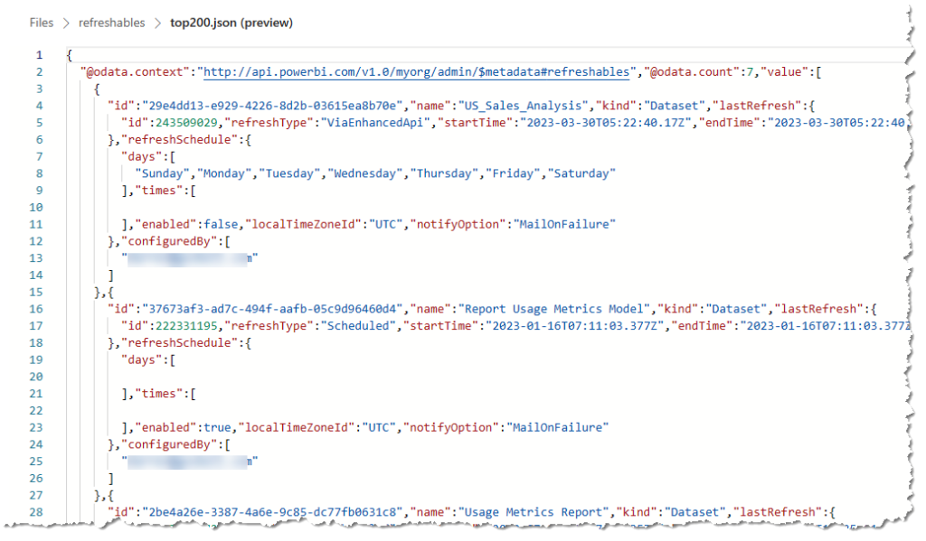
# write raw data to a json file
with open("/lakehouse/default/Files/refreshables/top200.json", 'wb') as f:
f.write(refreshables_response.content)
The Output
If we then open our lakehouse and have a look at the file that was generated, we can see the data returned from our API call.
Conclusion
Most of the script was just involved in getting the authentication working and the core portion that then calls the REST API was relatively simple.
This is all relatively new to me and I’m still learning about Python and Notebooks, so if you see anything where I’m not doing things the “right way” feel free to point them out. I’m planning to do some more Notebook related posts in the future. I’m particularly interested in pushing data into delta tables and then building a Power BI dataset in Direct Lake mode, so stay tuned for that.
Currently Power BI does not support a way for dynamically setting a default value for a slicer using an expression. One common example of where this sort of capability would be really useful is if you have a dashboard that you want to default to show the current day’s data by default, but you want the user to be able to select a custom date filter if they so desire.
While I could go into my report and set a slicer to filter it for today’s date of 15 May 2023. When I open the report tomorrow this slicer will still have the hard coded value of 15 May 2023. You could potentially create measures that use something like: CALCULATE([Sales], 'Calendar'[Date] = Today() ) there are a number of problems with this. While it will automatically show the Sales amount for the value of Today() – the problem is that on the Power BI Service “Today” is set based on the UTC time. So depending on what timezone you are in the day can change part way through your working hours.
While there currently is no built-in way of configuring this within a slicer itself this there are workarounds and I’m going to walk you through one approach that I’ve used in the past. This approach has a couple of moving parts. The first one is that as part of a nightly data load process I update a number of columns in a shared “Calendar” table.
Implementation
In the example below I’ve added 3 indicator columns for IsToday, IsYesterday and IsCurrentMonth. This post was published on 15 May 2023 so for that date the IsToday column has a value of True.
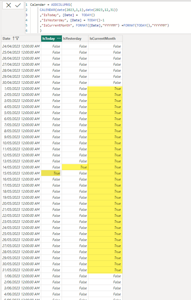
NOTE: I’ve simulated this in a simple Power BI example using a calculated table, but you need to be very careful using a calculated table in a production scenario since the Power BI service runs in UTC time so depending on when your data transforms get run your indicator columns could be updated incorrectly.
Once I’ve built out the body of my report, adding visuals and slicers I create 4 bookmarks:
- Custom Range – this has no report level filters and has my date slicer set as visible
- Today – this has a report level filter for IsToday=True and sets the date slicer to hidden
- Yesterday – this has a report level filter for IsYesterday=True and sets the date slicer to hidden
- Current Month – this has a report level filter for IsCurrentMonth=True and sets the date slicer to hidden
Then I add add 4 buttons to my report, one for each of the bookmarks above. Then as I click on each button it changes the filtering appropriately.
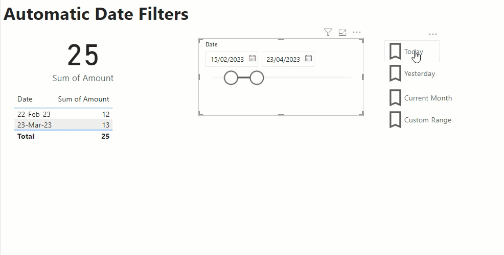
If I save and publish my report with the Today bookmark selected this means that each night when my data load routine is run, and my data model is refreshed the IsToday column is updated. Then the next morning when my users open the report they see the data automatically filtered for the current date. And if they wish to view some other date, I have a set of handy short cuts for common date filters, or they click on the Custom Range option to set their own custom filter.
Limitations
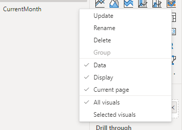
Where this approach falls down a bit is when you have multiple pages in your report, and you want the date filters to affect all the pages. For the indicator columns it’s easy enough to set the filters linked to your bookmarks as report level filters. And you can setup your “custom range” slicer as a sync’ed slicer so that it affects multiple pages. The tricky bit comes with the showing and hiding the slicer as you can only show and hide a visual on the current page with a bookmark.
The approach I chose to take was to make the “Custom Range” bookmark have the “Current page” option set so that the user was always returned to the first page in the report if they selected that option. It’s not ideal, but otherwise you would need different “Custom Range” bookmarks per page and it just gets a bit messy.
If you look at the Power BI audit logs for paginated reports you can see which user ran which report and when, but you cannot see any parameter values. This is by-design since parameter values are considered “customer content” and no content like this is included in the Power BI logs.
But if your company has a requirement to log which parameter values were used when running a report then this is something you will need to build yourself.
One possible way of doing this is to add a dataset to your report which does an insert command or calls a stored procedure to insert a record into a custom audit table.
I did this using Azure SQL and creating the following table:
CREATE TABLE [dbo].[ReportExecutionLog](
	[ReportName] [nvarchar](255) NULL,
	[UserName] [nvarchar](255) NULL,
	[Parameters] [nvarchar](max) NULL,
	[DateTime] [datetime] NULL
)
And the following Stored Procedure:
CREATE PROC [dbo].[sprInsertLogRecord]( @reportName NVARCHAR(255),
@userName NVARCHAR(255),
@params NVARCHAR(MAX))
as
INSERT INTO [dbo].[ReportExecutionLog]
([ReportName]
,[UserName]
,[Parameters]
,[DateTime])
VALUES
(@reportName
,@userName
,@params
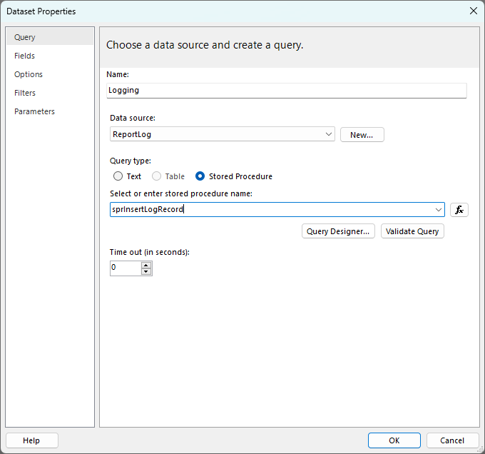
,getdate())Then I added a connection to my Azure SQL database in Report Builder and created a new dataset called “Logging” and configured it to call this stored procedure.
Then in the parameters section I set it up to pass in the global ReportName and UserID values
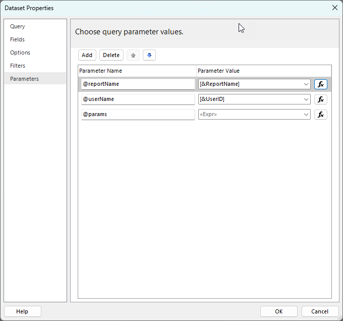
Note: Unfortunately there is currently no way to get the ReportID or WorkspaceID, hopefully this gets added at some point in the future. For the time being this means that you need to make sure that any reports you want to add logging to must have unique names. You could possibly look at adding some unique report ID to your report name to ensure this.
In the screenshot above you can see that there is an expression for the parameter values that I want to capture, this is calling a small custom function. The code in the expression is as follows and I’m just passing in an array of the parameter name that I want to log:
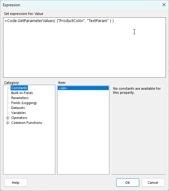
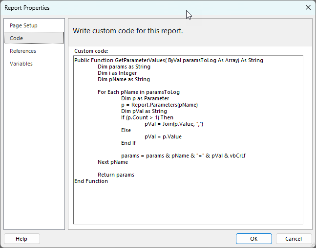
The GetParameterValues function is as follows:
Public Function GetParameterValues( ByVal paramsToLog As Array) As String
	Dim params as String
	Dim i as Integer
	Dim pName as String

	For Each pName in paramsToLog
		Dim p as Parameter
		p = Report.Parameters(pName)
		Dim pVal as String
		If (p.Count > 1) Then
			pVal = Join(p.Value, ",")
		Else
			pVal = p.Value
		End If

		params = params & pName & "=" & pVal & vbCrLf
	Next pName

	Return params
End Function
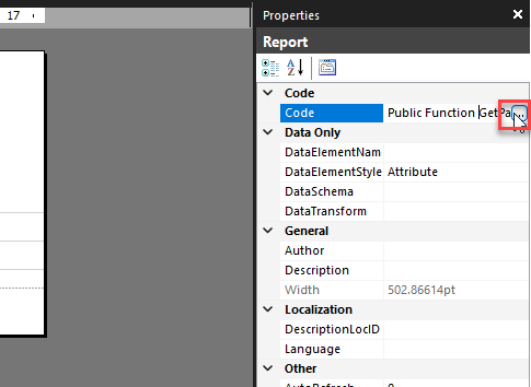
I entered this in the “Code” property for the report by clicking in the dark gray background area to expose the report level properties
Then when you click on the … button to edit the code value I paste the code into the “Custom code” area.
This then produces output like the following.
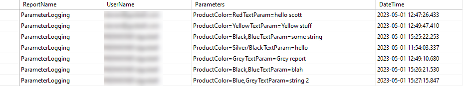
Note that in my function I am using a newline between each parameter which SSMS does not show in it’s grid output, but you can see them if you build a report over this log table. If you want to a different delimiter between the parameters you could simply replace the vbCrLf value in the function above with something else.
If saw this announcement last month – Query parallelization helps to boost Power BI dataset performance in DirectQuery mode | Microsoft Power BI Blog | Microsoft Power BI – about the new MaxParallelismPerQuery setting and you were interested in testing, but you were not sure how to run the sample code then read on.
The sample code in the blog post above is a full .net program that you could compile and run from Visual Studio or from the command line compiler. But that is something that not all BI developers are comfortable doing. If you are able to use Tabular Editor then there is a much simpler way to change this setting.
- Launch Tabular Editor and connect to the XMLA endpoint for your workspace (so this requires a premium workspace).
- Select the dataset you wish to test.
- Paste the code below into the “C# Script” tab in TE2 or open a new C# Script document in TE3. The sample script sets the parallelism to 10, you can experiment with different values by changing the value in the last line of the script.
- Then click the run button.
- Finally click the save button to save this change back to Power BI
If you cannot see the code above you can download it directly from here: TabularEditorSetMaxParallelism.csx (github.com)
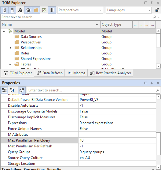
And once you have updated the compatibility setting of the database you can also change the Max Parallelism Per Query setting directly from the model explorer in Tabular Editor
Today I am pleased to announce that the next update to DAX Studio is now available. It is a minor point release that includes one or two small updates and a number of fixes including what is hopefully a definitive fix to the “xmlReader in use” errors some of you have been seeing in 3.0.6
Check out the detailed release notes here v3.0.7 Release | DAX Studio
Recent Comments