I was working on report with a business user and one of the outputs he wanted to see was a list of over 100 tasks that needed to be performed on specified groups of equipment.
One of the initial views they wanted to see is list of these tasks with about 7-8 descriptive columns so a table visual made the most sense. However, for each of those tasks there would be 1 or more pieces of equipment and for each piece of equipment it could be in 1 of 4 states depending on the last time the task was performed.
The states that a piece of equipment could be in are:
- Compliant (the task was performed before the due date)
- Due Now (the due date has passed, but each task has a certain amount of tolerance and we are within that tolerance)
- Overdue (the task is past the due date and tolerance)
- Missing (cannot find any historic occurrence of this task)
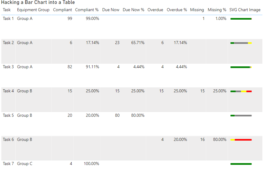
The above information is just for some context, but they key take away is that we had a table and 4 percentages that added up to 100% across each row.
The problem was that the information was very text heavy and it was difficult to see which tasks were OK and which ones needed attention without reading each row carefully one at a time. I initially tried adding some conditional formatting of the background colours and that helped a little bit, but it still was not clear.
What would have been really nice was to use a 100% stacked bar chart, but we had too many descriptive columns to use one of these visuals on its own and we had too many rows to be able to just position one next to the table.
If you are interested in seeing an implementation of each of the approaches outlined below a copy of the PBIX file I used for the images in this blog post will be linked at the end of this post
Approach 1: Using an SVG Measure
What would have been ideal would be to use a measure to generate an SVG image. There are a number of blog posts available that show how you can generate SVG strings in DAX. Unfortunately due to the limitation that all images in tables and matrices are forced to be square and you cannot specify a rectangle that is wider than it is high.
If you would like to see the limitation removed that forces images to have the same width and height please vote for this idea
I did do a quick test to confirm that this restriction was an issue and it produced output like the following which was no good as it forced each row to be too tall.
At this point I reached out to some friends to see if anyone else had some ideas for solving this issue or whether I would need to consider a different design for the report. This ended up in a great 3-way conversation between myself, Daniel Marsh-Patrick ( b | t ) and Kerry Kolosko ( b | t )
Approach 2: Using a Measure with extended unicode characters
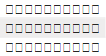
After explaining the issue and what approaches I had already considered Daniel quickly came up with the idea of using extended unicode characters to approximate a bar chart. If you scroll down to the bottom of this page which shows some of the extended unicode characters you can see that there are some characters which are colored squares.
There are only 7 different colours (and a black and white square) but that is enough to build a simple bar chart.
Using the following measure we are able to generate a series of coloured squares to represent each of our percentages. (note you should see different coloured squares in the code below, if you don’t keep reading for an explanation of this)
Unicode Chart =
VAR purple = "🟪"
VAR brown = "🟫"
VAR green = "🟩"
VAR red = "🟥"
VAR orange = "🟧"
VAR yellow = "🟨"
VAR blue = "🟦"
VAR white = "⬜"
VAR black = "⬛"
VAR Scale = 10
VAR Compliant = COALESCE(MROUND([Compliant %], (1/Scale)) * Scale,0)
VAR DueNow = COALESCE(MROUND([Due Now %], (1/Scale)) * Scale, 0)
VAR Overdue = COALESCE(MROUND([Overdue %], (1/Scale)) * Scale, 0)
VAR Missing = COALESCE(MROUND([Missing %], (1/Scale)) * Scale, 0)
RETURN
IF (HASONEVALUE('Tasks'[Task]),
REPT(green, Compliant) &
REPT(white, DueNow) &
REPT(yellow, Overdue) &
REPT(red, Missing)
, BLANK()
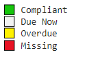
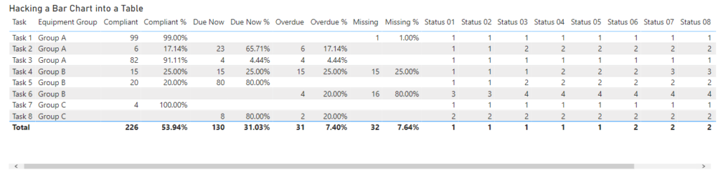
)I selected a scale value of 10 which builds a simplistic bar chart where each square represents 10%. I This chart uses the following colour coding
And this produces a result like the following, which is really cool since all of the logic is contained in a single measure:
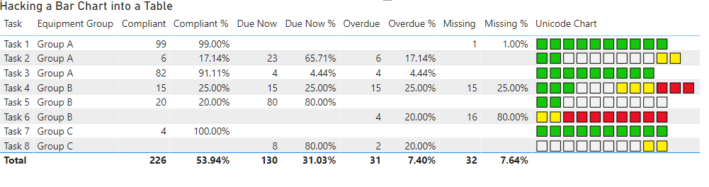
However, you will notice that there are a couple of issues with the bar charts above. This is because I have specifically chosen the amounts I used in the test data to highlight some of the problems with this sort of approach.
- Task 1: appears to be 100% compliant, but is actually only 99%
- Task 2: has 11 squares due to multiple categories being rounded up
- Task 3: has only 9 squares due to multiple categories being rounded down
- Task 4: has 12 squares due to multiple categories being rounded up
In my specific circumstance, since the goal is to get every task to a status of 100% compliant, the issue with Task 1 was actually the most critical. I did not want something to appear to be 100% compliant if it was not actually at 100%. While annoying from an esthetics point of view the issue of there not always being exactly 10 squares was not a deal breaker.
However we did find one deal breaker with this approach and that is that it appears as follows on some machines, with just a series of white squares on every row:
I think this is probably because Power BI uses the fonts from the client machines when rendering text. So maybe there were different versions of the standard fonts. But even on some machines supposedly running the identical version of Windows 10 we still saw instances of this issue. This is pretty much a deal breaker for this approach as there was no way to guarantee that the necessary extended characters would be available on all the client machines.
Approach 3: A creative use of conditional formatting
It was at this point that Kerry came up with the inspired suggestion of creating 10 columns and using conditional background colours to simulate the bar chart.
I started off by creating the first measure using the following expression.
Status 01 =
var block = 1   // the number of the current block
var scale = 10  // controls the number of blocks
var comp =   MROUND([Compliant %],(1/ scale)) * scale
var dueNow =  comp + (MROUND([Due Now %],1/ scale) * scale)
var overdue =  dueNow + (MROUND([Overdue %],1/ scale) * scale)
var missing =  overdue + (MROUND([Missing %],1/ scale) * scale)
var result = SWITCH(TRUE(),
    comp >= block , 1,
    dueNow >= block , 2,
    overdue >= block , 3,
    missing >= block , 4,
    blank()
)
return result
I setup all the key components as variables so then I just had to copy paste the code 9 more times just changing the name and the value of the “block” variable. (you can see these 10 measures in the report linked at the bottom of this post)
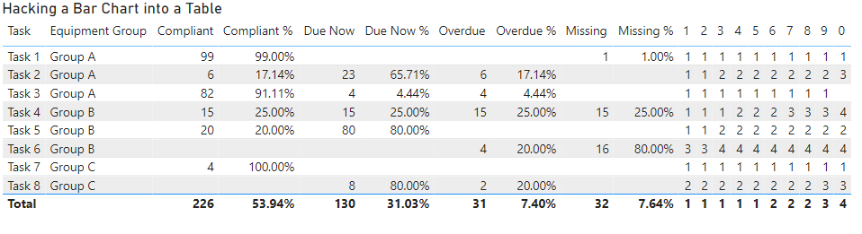
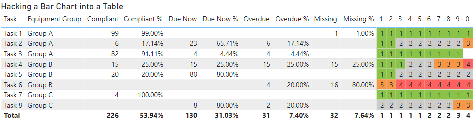
If you drop these 10 measures into a table you get output like the following:
By renaming each of the measures so they are just a single digit from 1 to 0 we can shrink down the table so that it easily fits on the page without horizontal scroll bars
In my first pass I started off creating rules for the background colour. This involved creating 4 rules, one for each colour and doing this 10 times (once for each column). You can see the rules for column 1 below.
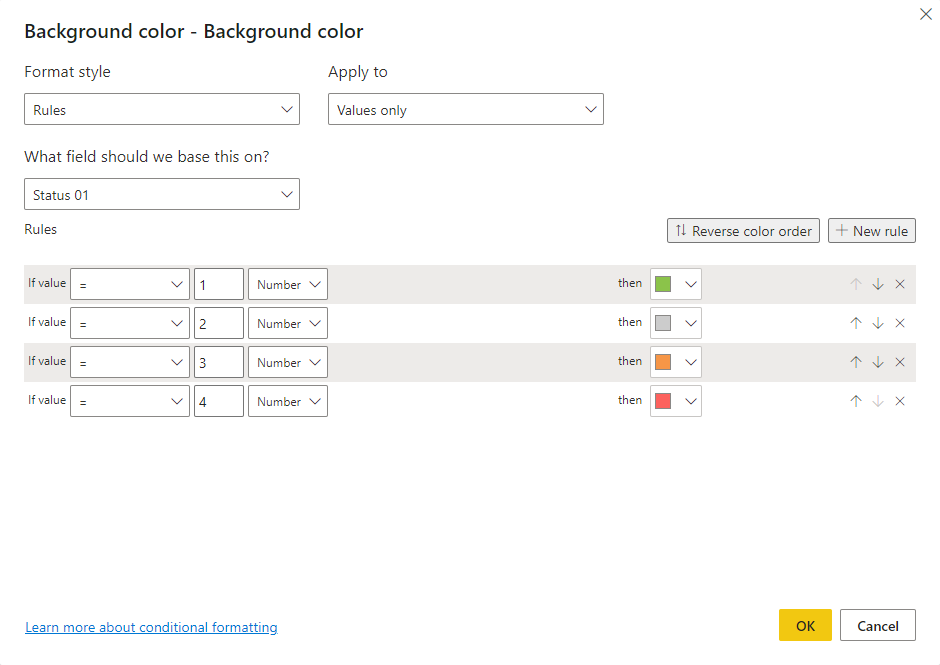
After doing a couple of columns this got a bit tedious. The technique was working, but it was taking a lot of clicks per column which made me wonder if there was a better way. But you can see from the image below how the rules were working.
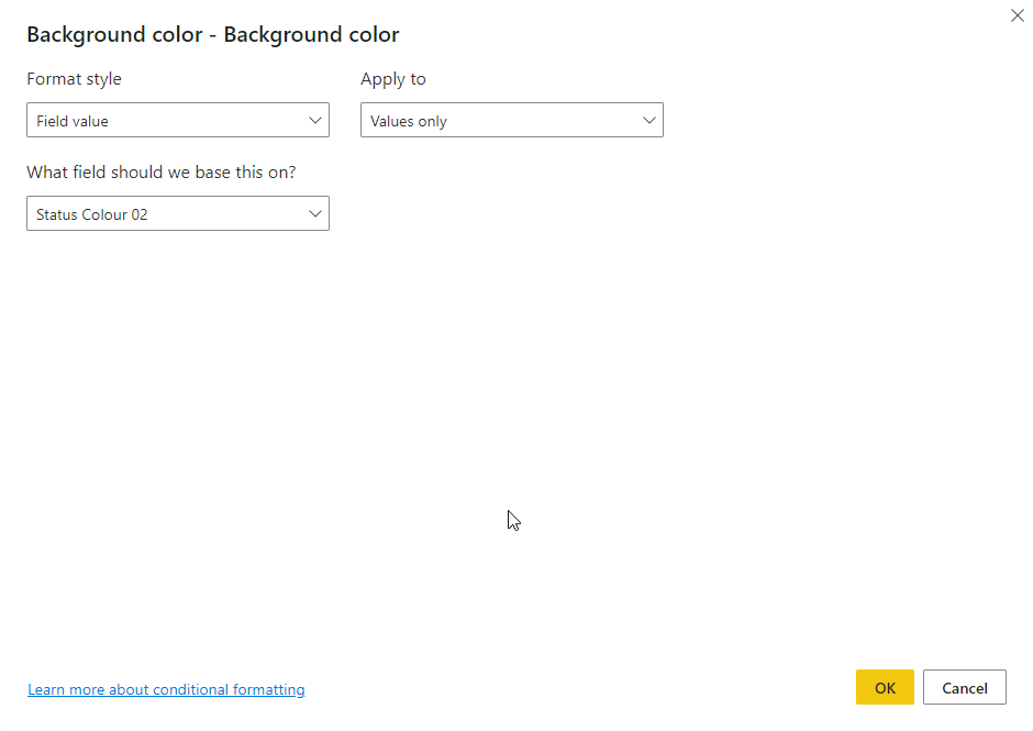
If you look at the options for the conditional formatting instead of using a rules based approach you could use the value coming from a column or measure. So I created 10 measures like the following which returned the background colour as a hex string instead of returning a numeric value between 1-4 that I could use in the rules.
Status Colour 01 =
var block = 1
var scale = 10
var compliant =   MROUND([Compliant %],(1/ scale)) * scale
var dueNow =  compliant + (MROUND([Due Now %],1/ scale) * scale)
var overdue =  dueNow + (MROUND([Overdue %],1/ scale) * scale)
var missing =  overdue + (MROUND([Missing %],1/ scale) * scale)
var compliantColour = "#8BC34A"
var dueNowColour = "#CCCCCC"
var overdueColour = "#F69647"
var missingColour = "#FD625E"
var result = SWITCH(TRUE(),
    compliant >= block , compliantColour,
    dueNow >= block , dueNowColour,
    overdue >= block , overdueColour,
    missing >= block , missingColour,
    blank()
)
return result
This meant I could change the conditional formatting settings to look as follows which just required me to change the Format Style to “Field value” and then pick the relevant measure.
This was a much simpler approach which took much less time to configure and once I configured both the background and foreground colours it resulted in an output like the following.
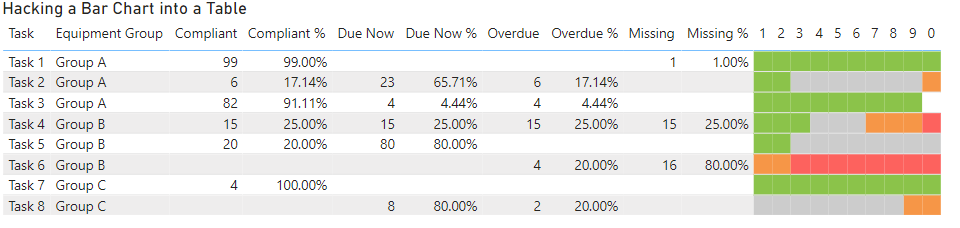
The only remaining issue was the 1-0 column headings, but I “fixed” that by positioning a text box with a white background over the top of these.
What about other options like Charticulator or the HTML Content custom visual?
I’m sure there are many of you wondering if this approach of hacking a table was the best option and what other approaches might have worked. Below are some of the other options which I considered and subsequently chose not to pursue.
Create a Custom Visual – I have dabbled a bit with coding custom visuals and I could have potentially built my own, but it would have taken days and days to do this not hours. And then there is the requirement to maintain and update the custom visual over time which adds extra burdens to this approach which makes it unfeasible for visuals with a limited re-use potential
Charticulator – I have not used this very much so there may be an approach I missed (and I’m more than happy to be proven wrong if someone wants to have a go at implementing this). But from what I could see there is no way to force the individual text glyphs to be constrained to a given column size so if some of the description fields were longer than the available space they would overlap with the next “column” instead of wrapping like they do with a table.
HTML Content Visual – I actually got really close to the original concept for this report with the HTML Content Visual, but one key bit of functionality that I needed to support was the ability to drill through from the table to a detail page. Unfortunately the HTML Content Visual does not currently support any way of configuring drillthrough.
Download the sample file
If you are interested to play with the example file used in this post you can get it from here


Recent Comments