Darren Gosbell

Category: Power BI

Diagnosing Performance of Paginated Reports in Power BI

Sometimes when you have a slow paginated report it’s hard to know where to start in order to improve the performance.

There is a feature in Paginated Reports on the Power BI service that was released a number of months ago which will show you a breakdown of the performance of that report.

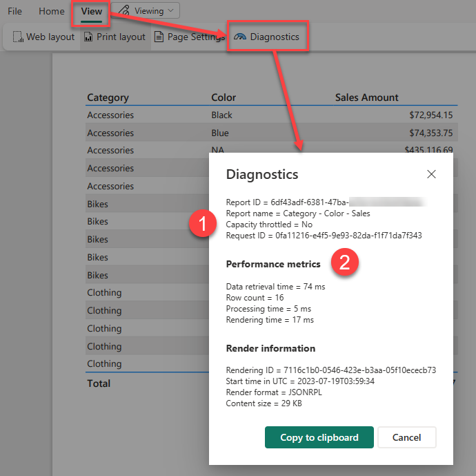
After you have run your report you can access this feature by going into the View menu and clicking on the Diagnostics button

The Paginated Report Diagnostics dialog

Power BI Report Server and SQL Server Reporting Services do not have this button on the report itself, but you can get the same timing information by querying the ExecutionLog3 view in the ReportServer database (see Report Server ExecutionLog and the ExecutionLog3 View – SQL Server Reporting Services (SSRS) | Microsoft Learn)

This dialog shows us a number of pieces of interesting information about the report execution.

  1. Note the item at the top here which says “Capacity throttled = no” this applies to premium capacities and tells you if the capacity is currently in a throttled state. This is important as throttling adds a delay to interactive operations like report rendering and so your report may have slow performance because previous operations on the capacity have put it into a throttled state.
  2. This second section of the report shows you a breakdown of the different category of operations in the report as well as a count of the total dataset rows that were processed.

If you want to understand what is happening during each step of the performance metrics, I found the following information in this archived blog post from a former member of the SSRS team which breaks down the operations which go into each of these 3 categories.

Data Retrieval Time

The number of milliseconds spent interacting with data sources and data extensions for all data sets in the main report and all of its subreports. This value includes:

  • Time spent opening connections to the data source
  • Time spent reading data rows from the data extension

Note: If a report has multiple data sources/data sets that can be executed in parallel, TimeDataRetrieval contains the duration of the longest DataSet, not the sum of all DataSets durations. If DataSets are executed sequentially, TimeDataRetrieval contains the sum of all DataSet durations.

Processing Time

The number of milliseconds spent in the processing engine for the request. This value includes:

  • Report processing bootstrap time
  • Tablix processing time (e.g. grouping, sorting, filtering, aggregations, subreport processing), but excludes on-demand expression evaluations (e.g. TextBox.Value, Style.*)
  • ProcessingScalabilityTime**

Rendering Time

The number of milliseconds spent after the Rendering Object Model is exposed to the rendering extension. This value includes:

  • Time spent in renderer
  • Time spent in pagination modules
  • Time spent in on-demand expression evaluations (e.g. TextBox.Value, Style.*). This is different from prior releases, where TimeProcessing included all expression evaluation.
  • PaginationScalabilityTime**
  • RenderingScalabilityTime**

** The “scalability” times are when the engine does extra operations to free up memory in response to memory pressure issues during processing, pagination or rendering

Optimizing Report Performance

If you are interested in ways to optimize the performance of a paginated report, then many of the techniques outlined in this old article are still perfectly valid even though it was written for SQL 2008R2 – you can just ignore some of the points that are specific to on-prem scenarios like point 2 using Shared Data Sources which are not available in the Power BI service.

Setting a dynamic default slicer value in Power BI

Currently Power BI does not support a way for dynamically setting a default value for a slicer using an expression. One common example of where this sort of capability would be really useful is if you have a dashboard that you want to default to show the current day’s data by default, but you want the user to be able to select a custom date filter if they so desire.

While I could go into my report and set a slicer to filter it for today’s date of 15 May 2023. When I open the report tomorrow this slicer will still have the hard coded value of 15 May 2023. You could potentially create measures that use something like: CALCULATE([Sales], 'Calendar'[Date] = Today() ) there are a number of problems with this. While it will automatically show the Sales amount for the value of Today() – the problem is that on the Power BI Service “Today” is set based on the UTC time. So depending on what timezone you are in the day can change part way through your working hours.

While there currently is no built-in way of configuring this within a slicer itself this there are workarounds and I’m going to walk you through one approach that I’ve used in the past. This approach has a couple of moving parts. The first one is that as part of a nightly data load process I update a number of columns in a shared “Calendar” table.

Implementation

In the example below I’ve added 3 indicator columns for IsToday, IsYesterday and IsCurrentMonth. This post was published on 15 May 2023 so for that date the IsToday column has a value of True.

NOTE: I’ve simulated this in a simple Power BI example using a calculated table, but you need to be very careful using a calculated table in a production scenario since the Power BI service runs in UTC time so depending on when your data transforms get run your indicator columns could be updated incorrectly.

Once I’ve built out the body of my report, adding visuals and slicers I create 4 bookmarks:

  1. Custom Range – this has no report level filters and has my date slicer set as visible
  2. Today – this has a report level filter for IsToday=True and sets the date slicer to hidden
  3. Yesterday – this has a report level filter for IsYesterday=True and sets the date slicer to hidden
  4. Current Month – this has a report level filter for IsCurrentMonth=True and sets the date slicer to hidden

Then I add add 4 buttons to my report, one for each of the bookmarks above. Then as I click on each button it changes the filtering appropriately.

If I save and publish my report with the Today bookmark selected this means that each night when my data load routine is run, and my data model is refreshed the IsToday column is updated. Then the next morning when my users open the report they see the data automatically filtered for the current date. And if they wish to view some other date, I have a set of handy short cuts for common date filters, or they click on the Custom Range option to set their own custom filter.

Limitations

Where this approach falls down a bit is when you have multiple pages in your report, and you want the date filters to affect all the pages. For the indicator columns it’s easy enough to set the filters linked to your bookmarks as report level filters. And you can setup your “custom range” slicer as a sync’ed slicer so that it affects multiple pages. The tricky bit comes with the showing and hiding the slicer as you can only show and hide a visual on the current page with a bookmark.

The approach I chose to take was to make the “Custom Range” bookmark have the “Current page” option set so that the user was always returned to the first page in the report if they selected that option. It’s not ideal, but otherwise you would need different “Custom Range” bookmarks per page and it just gets a bit messy.

Setting MaxParallelismPerQuery on a Power BI Dataset using Tabular Editor

If saw this announcement last month – Query parallelization helps to boost Power BI dataset performance in DirectQuery mode | Microsoft Power BI Blog | Microsoft Power BI – about the new MaxParallelismPerQuery setting and you were interested in testing, but you were not sure how to run the sample code then read on.

The sample code in the blog post above is a full .net program that you could compile and run from Visual Studio or from the command line compiler. But that is something that not all BI developers are comfortable doing. If you are able to use Tabular Editor then there is a much simpler way to change this setting.

  1. Launch Tabular Editor and connect to the XMLA endpoint for your workspace (so this requires a premium workspace).
  2. Select the dataset you wish to test.
  3. Paste the code below into the “C# Script” tab in TE2 or open a new C# Script document in TE3. The sample script sets the parallelism to 10, you can experiment with different values by changing the value in the last line of the script.
  4. Then click the run button.
  5. Finally click the save button to save this change back to Power BI

If you cannot see the code above you can download it directly from here: TabularEditorSetMaxParallelism.csx (github.com)

And once you have updated the compatibility setting of the database you can also change the Max Parallelism Per Query setting directly from the model explorer in Tabular Editor

Power BI – Using Field Parameters in Paginated Reports

Field Parameters are a relatively new feature in Power BI which are still in preview and they add a lot of flexibility to an interactive reporting solution, but can they be used in paginated reports?

The short answer is yes, but the experience is not as simple as it is in Power BI Desktop. The reason for this is that Power BI Desktop does not just pass field parameters as filters to other visuals, they actually change the way the underlying DAX queries are generated.

The following example of an Adventure Works based report with a field parameter that allows the user to choose between showing either the Total Sales measure or the Total Quantity measure.

If we use the Performance Analyzer in Power BI Desktop to capture all the queries for this page we find 2 sets of queries.

The first one for the slicer looks as follows and just gets a list of values from our Field parameter table:

// DAX Query
DEFINE
  VAR __DS0Core = 
    SUMMARIZE(
      VALUES('Measures Parameter'),
      'Measures Parameter'[Measures Parameter Fields],
      'Measures Parameter'[Measures Parameter Order],
      'Measures Parameter'[Measures Parameter]
    )

  VAR __DS0PrimaryWindowed = 
    TOPN(
      101,
      __DS0Core,
      'Measures Parameter'[Measures Parameter Order],
      1,
      'Measures Parameter'[Measures Parameter],
      1,
      'Measures Parameter'[Measures Parameter Fields],
      1
    )

EVALUATE
  __DS0PrimaryWindowed

ORDER BY
  'Measures Parameter'[Measures Parameter Order],
  'Measures Parameter'[Measures Parameter],
  'Measures Parameter'[Measures Parameter Fields]

To start integrating our Field Parameters into our paginated report we can create a new paginated report using Power BI Report Builder and we can copy and paste this query into a new dataset. I’ve called this dataset “MeasureParameter” in the screenshot below:

We can then create a new report Parameter linked to this dataset. I’ve called my parameter “MeasureName” and I’ve linked up the available values as follows:

Note that I’m using the field for the Value property which returns the full DAX reference for the measure (eg. ‘Sales'[Total Sales]) and I’m using the display name of the measure for the label field (eg. “Total Sales”)

This will generate a parameter like the following when the paginated report is run to allow the user to select which measure to use:

If we then look at the second set of queries in the Performance Analyzer, we can see that the there are actually 2 queries.

  1. Gets the data for the chart and this query is dynamically generated
  2. Gets the name of the currently selected Field Parameter which is used to populate the chart title and axis labels

We can ignore query 2 as we already have the information about the field parameters in our MeasureParameters dataset, but how do we dynamically generate our query in the same way that Power BI does?

The answer to this is using expressions. Paginated Reports are extremely powerful in this regard and almost all of the properties of the objects in a report can set using expressions – even the query text and that is what we are going to do in this case.

If we look at the text of the first query we captured from Performance Analyzer, it looks as follows:

Where you can see on lines 4 and 7 that the ‘Sales'[Total Sales] measure is referenced (which I’ve highlighted in yellow. And on lines 7, 10 and 16 that this is given a name of [Total_Sales] in the output from the query. The [Total_Sales] is just a column name in the results of the query and we could leave it as end users of our report will not see this reference, but I prefer to make it clear that this is may not always be the Sales measure, so I renamed it to [Measure_Value]

Then I created a new Dataset called “Dataset1” and pasted the above static query in and clicked “OK” this saves our dataset and generates the field mappings for us. (you can manually create the field mappings from the resultset to the paginated dataset, but I find this method of starting with a static query easier)

Then to make this query dynamic I clicked the “fx” button next to the Query property to open the expression editor.

I then made the following changes to the query text:

  1. First, I started the expression with an = sign, this tells the report engine that this value needs to be evaluated as an expression. Then I added a double quote character as this is the start of a string expression.
  2. Then I added a closing double quote character at the end of the query.
  3. I then went through the rest of the query and doubled up any existing double quote characters to escape them.
  4. Finally, I inserted some concatenation expressions to add in the Value property from our MeasureName parameter which we added earlier using the Parameters!MeasureName.Value reference.
configuring the dynamic query

So, we now have a dynamic query which will inject the measure to be used based on the parameter chosen by the user at run time.

To test this we can put a simple table on our report canvas and link up the Color and Measure value fields

Configuring the column references for the table visual

This gives us a table which looks like the following

The design time report layout

And when we run it and choose a measure from the parameter we get the data we expect, but we cannot easily tell from the report which measure was selected by the user since the column header just says “ID Measure Value”. So if this report was exported to a PDF or sent as part of an emails subscription it might be hard to tell which measure was selected.

The basic report with a dynamic query

To fix this we can right click on the “ID Measure Value” header and turn this column header into an expression instead of being static text.

Editing the measure expression for the column header

Then we can use an expression like the following to use the label of the selected parameter value as column header

=Parameters!MeasureName.Label

If we also bold the column headers, now when we run our report, we get an experience almost identical to that in Power BI Desktop and our table now shows which measure was selected in the header for the measure column.

Final Report

This same technique of using an expression-based query could be adapted to work with field parameters that reference columns instead of measures. The expression for the query would just need to be adjusted differently, but I will leave this as an exercise for the reader.

DAX Studio and Tabular Editor – better together

I love love the way Phil Seamark likes to push the art of the possible with the Microsoft BI platform. And I really liked his recent article on using VS Code to query a Power BI file and generate measures. But as I was reading that blog post I could not help but think that it was going to be outside of the comfort zone of a lot of Power BI users.

I know a lot of BI developers that have strong skills in DAX, Power Query and SQL, but don’t often use C# and many of them don’t use VS Code and have not heard of nuget. So this made me wonder if there was a another way of doing the same thing with the tools that many BI developers already use like DAX Studio and Tabular Editor

I actually figured out a couple of approaches to achieving the same result as Phil. The first one uses the following 2 pieces of information.

  1. Tabular Editor has a brilliant feature called Advanced Scripting which lets you run little pieces of C# code and is an excellent way of automating changes in your models. And in addition to being able to use the standard properties and methods Daniel has build a series of helpful “helper” methods like AddMeasure which has parameters for <Name>, <Expression> and <Folder>.
  2. As I showed in my previous post where I generated part of a DAX query using another DAX query. It is possible with some careful string manipulation to use DAX to generate other code such as the C# using in the Tabular Editor Advance Scripting feature.

If we combine the two pieces of information above we end up with the following query which generates a Tabular Editor AddMeasure() call for each value in Product[Color].

EVALUATE 
ADDCOLUMNS(
VALUES('Product'[Color])
,"ScriptExpression"
,var _color = 'Product'[Color] 
var _name = "Sum of " & _color & " Sales Amount"
var _expression = "CALCULATE(SUM('Sales'[Sales Amount]) ,'Product'[Color] = \""" & _color & "\"")"                     
return "Model.Tables[""Sales""].AddMeasure( """ & _name & """, """ & _expression & """, ""AutoMeasures"");"
)

When you open DAX Studio from the External Tools menu and run this query you get output that looks like the following and you can selected the “ScriptExpression” column and copy that.

Then you open Tabular Editor from the External Tools menu. Click on the Advanced Scripting tab and paste in the output from the “ScriptExpression” column. Note this may include the “ScriptExpression” column header at the top which you will need to delete.

(note to self, I should add a “copy without headers” option to DAX Studio, there is an option for this, but it would be nice to add it to the right-click menu on the results)

Then when you click “run” (1) on the advance script, you will see a folder with all your new measures appear (2). You can then check that the expression has been entered correctly and click save (3) to make these appear back in Power BI Desktop.

Stay tuned for the next post in this series where I will show another technique for doing this.

Power BI Report Server – fixing Pending subscriptions

Last week I came across an issue where a number of our paginated report subscriptions at work failed to go out. When we checked in the Portal these subscriptions had a status of “Pending”. This happened on our production Power BI Report Server instance which is currently running the Sep 2019 release.

This was very strange as these subscriptions had been running for months and months without issue and just stopped all of a sudden. It was even more confusing as we had some reports with multiple subscriptions and some of the subscriptions were still working while others were stuck with a status of “Pending”.

With no other information to go on in the Portal I started looking through the log files. This was complicated in our case as we have over one and a half thousand users and hundreds of report subscriptions. We also have 2 instances of PBIRS (Power BI Report Server) behind a load balancer which means two sets of log files to search through.

So I started by going to one of the pending subscriptions and clicking on the edit option

When you do this you will see the URL change to something like the following where there is a guid at the end with the SubscriptionId:

By default PBIRS writes a number of log files out to a folder at C:\Program Files\Microsoft Power BI Report Server\PBIRS\LogFiles If you look in this folder it will look something like the following with a bunch of different files with date stamps on the end. In this case because the issue is with a paginated report we need to look in the ReportingServicesService*.log files

What I found in one of the log files when I searched for the subscription Id was the following error

Error processing data driven subscription a743db7f-bbbe-4c45-9da1-2e2e286992dd: Microsoft.ReportingServices.Diagnostics.Utilities.UnknownUserNameException: The user or group name '<domain>\<contractor user>' is not recognized.

Where the <domain> was our company’s AD domain and <contractor user> was the login that had been used by a short term contractor that had worked with us to build the report in question.

In our case the account in question had been disabled when the contractor left the organization. So obviously nothing was checking the enabled state of this account.

But as it turns out that our AD team had done one of their periodic clean-ups yesterday where they actually deleted a whole group of disabled accounts. So it appeared that this was related somehow to this account no long existing in AD.

We already knew from years of working with Reporting Services that when a subscription is executed that the Owner of the subscription is checked to make sure a valid account is specified. (I believe this is possibly a security measure to stop people setting up a schedule to send reports to somewhere after they have left a company). However we already had the contractor set the subscription owner to one of our service accounts when they created the subscription to try and prevent this very scenario from happening.

In fact searching through all the properties for the subscription in the portal showed no sign of the <contractor user> account anywhere.

At this point I decided to open up a PowerShell window and use one of the tools from the ReportingServicesTools PowerShell module to see if that could shed any more light on this issue.

When I ran the Get-RsSubscription cmdlet I noticed the following:

Sitting in the ModifiedBy property of the subscription object was a reference to our <contractor user> which we were seeing in the error in the log file.

When running Get-RsSubscription against a report where some subscriptions were working and others were stuck in a “Pending” state I could see that the working subscriptions had a ModifiedBy of an account belonging to someone who still had an active account in AD.

My guess as to what is happening here is that Report Server is attempting to populate some of the properties of a user object from Active Directory and is failing now that the users has been physically deleted and this is throwing an exception that is preventing the entire subscription from continuing with it’s execution.

So if you only have a handful of subscriptions stuck in a pending state like this you can just edit them in the portal and make some non-functional change like adding a full stop to the end of the subscription name. This will set the ModifiedBy to your user account and the subscription will start working again.

In our case we took a backup of the ReportServer database and then ran an update statement to set the guid of the ModifiedBy to the guid of our service account user. This is not a supported activity and something you would do at your own risk. But in our case it did allow us to quickly fix numerous “broken” subscriptions that would have taken hours to fix through the UI.

Power BI Report Server needs an Admin Portal

I think one area where Power BI Report Server could do with some more work is in the area of administrator tools. At the moment if a report fails to render because of an error you have to wait for a user to report it. And if a subscription fails to send there is no central place where you can see these issues and easily take steps to correct them.

Power BI: How to make the Gantt chart show events in progress

I had a colleague approach me at work with an interesting problem. He had a Power BI report using the Gantt chart custom visual however when he used a date slicer to select a date range it was only showing events which started on that date range and he wanted to see any events that were in progress for that date range.

I figured out a way to get this working and I thought it might be helpful to not just show the solution, but also to walk through the process I used to develop it. Let’s start by looking at an example of the issue he was dealing with.

Given the following data, what he wanted was to filter the data for dates between Mar-20 to Apr-10 so that the Gantt chart would show the section in Yellow below:

But he was getting output like the following, where it was only showing the bottom 3 tasks from the image above with a start date between Mar-20 and Apr-10. It was not showing tasks which were already in progress like the first two (Division… and Functional…).

To figure out what options we had to change this default behaviour I turned on the Performance Profiler in Power BI Desktop (I could also have used the All Queries trace in DAX Studio). This captured the following query for the Gantt visual:

// DAX Query
DEFINE VAR __DS0FilterTable = 
  FILTER(
    KEEPFILTERS(VALUES('Table1'[Start Date])),
    AND('Table1'[Star Date] >= DATE(2016, 3, 20), 'Table1'[Start Date] < DATE(2016, 4, 11))
  )

EVALUATE
  TOPN(
    1002,
    SUMMARIZECOLUMNS(
      'Table1'[Task Name],
      'Table1'[Task ID],
      'Table1'[Start Date],
      'Table1'[Resource],
      __DS0FilterTable,
      "MinEnd_Date", CALCULATE(MIN('Table1'[End Date]))
    ),
    'Table1'[Task ID],
    1,
    'Table1'[Task Name],
    1,
    'Table1'[Start],
    1,
    'Table1'[Resource],
    1
  )

ORDER BY
  'Table1'[Task ID], 'Table1'[Task Name], 'Table1'[Start], 'Table1'[Resource]

There are two important parts to notice from the above query.

First is that the filter is currently explicitly filtering for start dates based on the values selected in the slicer. Obviously this is going to cause an issue as events that are already in-progress will have a start date before the earliest date in the slicer.

To fix this we need to create a separate date table that does not have a relationship to our main fact table. In the demo file I simply created a calculated table using Date Slicer = CALENDARAUTO() but you can use whatever method you like to create this table.

If we replace the 'Table1'[Start Date] field used in the slicer that “fixes” our issue of start dates earlier than those in the slicer being filtered out, but now our slicer is not filtering the data at all, but all is not lost, we will fix that next.

The second interesting thing that I noticed from the captured query is that [Start Date] is being used as a grouping column in the SUMMARIZECOLUMNS() function, but [End Date] is getting the earliest end using CALCULATE(MIN('Table1'[End Date])). What is happening is that the Gantt chart is creating an implied measure when we pass in the [End Date] column. So instead of letting the Gantt chart create an implied measure we can create our own measure and use that instead.

Below is the measure I developed

Gantt End Date = 
VAR _maxDate =
    MAX ( 'Date Slicer'[Date] )
VAR _minDate =
    MIN ( 'Date Slicer'[Date] )
VAR _tasks = VALUES(Table1[Task ID])
RETURN
    MAXX (
        CALCULATETABLE (
            SUMMARIZE( Table1, Table1[Start Date], Table1[End Date] ),
            Table1[Start Date] <= _maxDate,
            Table1[End Date] >= _minDate,
            _tasks
        ),
        Table1[End Date]
    )

This gives us the following

If you look at the output of this measure in a table all it does is the following:

Note that I’ve force the display of all rows by including a simple row count measure. This lets us see that the [Gantt End Date] only returns values where the End date is after the start of the selected date range and the start is before the end of the selected date range, otherwise it returns a blank and SUMMARIZECOLUMNS does not return rows where all the measures return blank.

If you want to look at the Power BI file I used in the screenshots for this post you can download it from here

Building custom Data Bars in Power BI using SVG measures

So a while ago Power BI enabled the ability to display SVG images in tables and matrix visuals.  SVG is an XML based language and is actually what the majority of Power BI visual use to render their charts so this technique works really well in Power BI and gives you a way of drawing custom elements in your reports without having to go down the path of building a full blown custom visual. There have been some interesting examples of using this feature such as the sparkline measures created by David Eldersveld (blog) and Reed Haven (blog) and even this funky elephant on hatfullofdata.blog. .

However recently a friend of mine was wanting a way to just build some simple custom data bars with dynamic coloring. So I pulled together an example which produces the following output:

Basically I’m using a text element to output the measure value and drawing a small rectangle under the text calculating the length of the rectangle based of the percentage of the max value. There is also a conditional statement to make amounts less than 50 appear in red.

The code to produce this is relatively simple and I’ve broken it down into a bunch of different variables to hopefully make it easier to understand.

DataBar = 
    var _barMaxValue = MAXX(all(Sales[Category]), calculate(SUM(Sales[Amount])))
    var _barValue    = SUM(Sales[Amount])
    var _svgWidth    = 200
    var _svgHeight   = 200
    var _barHeight   = 30
    var _barWidth    = INT( (_barValue / _barMaxValue) * _svgWidth )
    var _fill        = IF( _barValue > 50, "blue", "red")
    var _svg_font    = "normal 100px sans-serif"
    var _svg_start   = "data:image/svg+xml;utf8,<svg xmlns='http://www.w3.org/2000/svg' viewBox='0 0 " & _svgWidth & " " & _svgHeight & "'>"
    var _svg_end     = "</svg>"
    var _svg_rect    = "<rect x='0' y='135' width='" & _barWidth & "' height='" & _barHeight & "' style='fill:" & _fill & ";fill-opacity:0.4' />"
    var _svg_text    = "<text x='5' y='120' witdh='" & _svgWidth & "' height='" & _svgHeight & "' style='font:" & _svg_font & "'>" & _barValue & "</text>"
return
    _svg_start &  _svg_rect & _svg_text  & _svg_end

The only “trick” to getting these SVG images to display correctly in the Table and Matrix visuals is to set their Data Category to ImageUrl. If you don’t do this the measure will just display the SVG as text (which could be useful for debugging more complex measures)

If you want to see a working example you can download an example pbix file from my OneDrive.

This was all relatively simple to do since I’ve worked with SVG before so it was not too hard to pull together something simple like this. The biggest problem that I had though was that Power BI restricts ImageUrl’s to only display inside a square, where as to build a nice custom data bar or sparkline using this technique you really want to work in a rectangular space that is 3-4 times wider than it is high.

So I’ve actually added and idea here to ideas.powerbi.com requesting that they change this in Power BI. Please vote for this if you think this would be a good idea.

Extending the Analysis Services Command Timeout in Power BI

There was a question recently in the Power BI forums on how to extend the timeout for a connection to Analysis Services used to import data into Power BI. In other tools you can add a setting like “Timeout=600” to the connection string to extend this timeout, but the Analysis Services connector in Power BI does not expose a way to set the raw connection string.

image

However if you look at the Source step in PowerQuery you’ll see that it calls the AnalysisServices.Database() function and if you check the documentation for this function you will see the following

CommandTimeout : A duration which controls how long the server-side query is allowed to run before it is canceled. The default value is driver-dependent.

So based on the above information my first attempt was to change the call to this function as follows, however this just resulted in an error:

image

This caused a fair bit of head scratching, but if you re-read the documentation carefully you’ll notice the following “CommandTimeout : A duration …”  and a duration is a specific data type in the M language which you can instantiate using the #duration( <days>, <hours>, <minutes>, <seconds>) constructor.

So changing the CommandTimeout option to the following fixes this issue and has the added benefit of being clearer that the timeout is now 5 minutes (when using the connection string parameter its never completely clear what the units of the timeout are)

= AnalysisServices.Databases(“localhost\tab17″, [TypedMeasureColumns=true, Implementation=”2.0”, CommandTimeout=#duration(0,0,5,0)])