Bump charts / Slope charts are an interesting way to show changes in rankings over time, but Power BI does not currently have a good built-in chart for this sort of visualization.
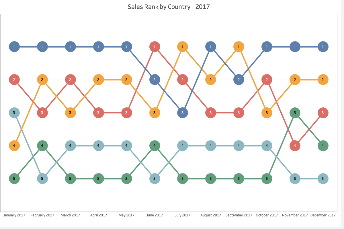
I saw an interesting example of one of these charts recently where the circles in the bump chart also change size based on the relative value of the metric.
There is a video on the Curbal channel showing how you can get pretty close with a line chart, but the circles are all the same size.
And Kerry Kolosko also has an example using deneb on her site. And while the circles are a constant size in her example, I was pretty sure that with a little tweaking I could make Deneb produce the sort of output I wanted.
I started using a copy of the data set from Curbal’s video. I used the existing [Rank bump chart] measure for the rankings and I created a simple Percent of Year measure using the following expression for the labels and sizing of the circles.
Percent of Year = DIVIDE([Sales], CALCULATE([Sales] , all(), values('Calendar'[Year])))And after a bit of experimenting and reading through the Vega and Vega-Lite documentation to figure out how to specify the size encoding for the circles I ended up with the following result which I was pretty pleased with.
Below is the Deneb specification for the above chart
{
  "$schema": "https://vega.github.io/schema/vega-lite/v5.json",
  "usermeta": {
    "deneb": {
      "build": "1.4.0.0",
      "metaVersion": 1,
      "provider": "vegaLite",
      "providerVersion": "5.4.0"
    },
    "interactivity": {
      "tooltip": true,
      "contextMenu": true,
      "selection": false,
      "highlight": false,
      "dataPointLimit": 50
    },
    "information": {
      "name": "Bump Chart",
      "description": "[No Description Provided]",
      "author": "Darren Gosbell",
      "uuid": "3416d242-19c2-4c88-b369-63d3f8ca302e",
      "generated": "2022-12-09T07:05:41.633Z"
    },
    "dataset": [
      {
        "key": "__0__",
        "name": "Year",
        "description": "This is the column for the X-Axis",
        "type": "numeric",
        "kind": "column"
      },
      {
        "key": "__1__",
        "name": "CategoryName",
        "description": "This is the column for the Y-Axis",
        "type": "text",
        "kind": "column"
      },
      {
        "key": "__2__",
        "name": "Rank bump chart",
        "description": "This is the ranking measure",
        "type": "numeric",
        "kind": "measure"
      },
      {
        "key": "__3__",
        "name": "Percent of Year",
        "description": "This is the value to display",
        "type": "numeric",
        "kind": "measure"
      }
    ]
  },
  "config": {
    "view": {"stroke": "transparent"},
    "font": "Segoe UI",
    "arc": {},
    "area": {
      "line": true,
      "opacity": 0.6
    },
    "bar": {},
    "line": {
      "strokeWidth": 3,
      "strokeCap": "round",
      "strokeJoin": "round"
    },
    "path": {},
    "point": {
      "filled": true,
      "size": 75
    },
    "rect": {},
    "shape": {},
    "symbol": {
      "strokeWidth": 1.5,
      "size": 50
    },
    "text": {
      "font": "Segoe UI",
      "fontSize": 12,
      "fill": "#666666"
    },
    "axis": {
      "ticks": false,
      "grid": false,
      "domain": false,
      "labelColor": "#666666",
      "labelFontSize": 12,
      "titleFont": "wf_standard-font, helvetica, arial, sans-serif",
      "titleColor": "#070f25",
      "titleFontSize": 16,
      "titleFontWeight": "normal"
    },
    "axisQuantitative": {
      "tickCount": 3,
      "grid": true,
      "gridColor": "#C8C8C8",
      "gridDash": [1, 5],
      "labelFlush": false
    },
    "axisX": {"labelPadding": 5},
    "axisY": {"labelPadding": 10},
    "header": {
      "titleFont": "wf_standard-font, helvetica, arial, sans-serif",
      "titleFontSize": 16,
      "titleColor": "#070f25",
      "labelFont": "Segoe UI",
      "labelFontSize": 13.333333333333332,
      "labelColor": "#666666"
    },
    "legend": {
      "titleFont": "Segoe UI",
      "titleFontWeight": "bold",
      "titleColor": "#666666",
      "labelFont": "Segoe UI",
      "labelFontSize": 13.333333333333332,
      "labelColor": "#666666",
      "symbolType": "circle",
      "symbolSize": 75
    }
  },
  "data": {"name": "dataset"},
  "encoding": {
    "x": {
      "field": "__0__",
      "type": "nominal"
    },
    "y": {
      "field": "__2__",
      "type": "nominal",
      "axis": null
    },
    "order": {
      "field": "__0__",
      "type": "nominal"
    }
  },
  "layer": [
    {
      "name": "Lines Layer",
      "mark": {
        "type": "line",
        "point": false,
        "interpolate": "monotone"
      },
      "encoding": {
        "color": {
          "field": "__1__",
          "legend": false,
          "scale": {
            "scheme": "pbiColorNominal"
          }
        }
      }
    },
    {
      "name": "Circle Layer",
      "mark": {
        "type": "circle",
        "tooltip": true,
        "opacity": 1
      },
      "encoding": {
        "color": {
          "field": "__1__",
          "legend": false
        },
        "size": {
          "field": "__3__",
          "type": "quantitative",
          "scale": {
            "range": [200, 2000]
          },
          "legend": null
        }
      }
    },
    {
      "mark": {
        "type": "text",
        "color": "white"
      },
      "encoding": {
        "text": {
          "field": "__3__",
          "format": "0%",
          "formatType": "pbiFormat"
        }
      }
    },
    {
      "transform": [
        {
          "window": [
            {"op": "rank", "as": "rank"}
          ],
          "sort": [
            {
              "field": "__0__",
              "order": "descending"
            }
          ]
        },
        {"filter": "datum.rank === 1"}
      ],
      "mark": {
        "type": "text",
        "align": "left",
        "baseline": "middle",
        "dx": 25,
        "fontWeight": "bold",
        "fontSize": 12
      },
      "encoding": {
        "text": {
          "field": "__1__",
          "type": "nominal"
        },
        "color": {
          "field": "__1__",
          "scale": {
            "scheme": "pbiColorNominal"
          },
          "legend": false
        }
      }
    },
    {
      "transform": [
        {
          "window": [
            {"op": "rank", "as": "rank"}
          ],
          "sort": [
            {
              "field": "__0__",
              "order": "ascending"
            }
          ]
        },
        {"filter": "datum.rank === 1"}
      ],
      "mark": {
        "type": "text",
        "align": "right",
        "baseline": "middle",
        "dx": -25,
        "fontWeight": "bold",
        "fontSize": 12
      },
      "encoding": {
        "text": {
          "field": "__1__",
          "type": "nominal"
        },
        "color": {
          "field": "__1__",
          "scale": {
            "scheme": "pbiColorNominal"
          },
          "legend": false
        }
      }
    }
  ]
}
If you prefer the look of the straight lines between the data points you can simply remove the "interpolate": "monotone" from the lines layer and you end up with a chart like the following one.
Hi Darren,
This is a great chart, is there anyway to make the text on X axis horizontal?
Thank you!
You can change the angle by adding an “axis” object with a “labelAngle” property to the “x” axis encoding
eg
  "encoding": {

    "x": {

      "field": "Year",

      "type": "nominal",

      "axis":{ "labelAngle": "0"}

    },
Awesome, thank you for the quick reply!
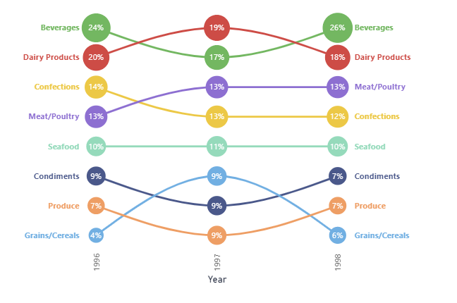
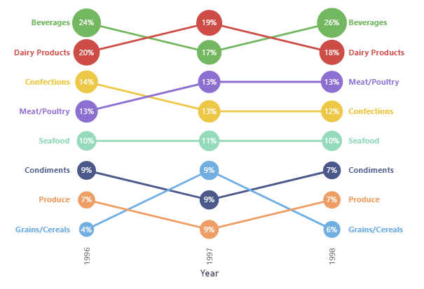
How do you deal with the same ranking. For example, both beverages and dairy products are ranked 1 at 25%?
The vertical position depends on the rank and the ranking depends on the actual sales amount, not the percentage. But if the sales amount was the same the two circles and the legend text would overlap. If you did not want this to happen you would need to figure out some sort of tie breaker to add to the ranking calculation, maybe doing something like adding the prior year percentage to the sales amount and then ranking based on that.
Thanks for reply.
I tried getting the text label to wrap into multiple line for readability, but couldn’t figure how to do it in vega-lite. So I ended up using the Dax Rank function so there is no ranking duplicate, ie. the ranking would be different even if the sales amount is the same.
Hello!
How did you solve issue with name not displaying for categories that start or end prior to start/end date?
For those it displays rankings, but without the name.