In my previous post I had a short 40 line script for Tabular Editor (free | paid) which could generate descriptions for the measures in your tabular model. There were a number of interesting questions in the comments to that post which I thought would make a follow up post worthwhile.
The things I want to cover in the post are
- Running the script in Tabular Editor 2 (free)
- Running the script in Tabular Editor 3 (paid)
- Dealing with Rate Limiting
- A Final Warning
How to run the script using TE2
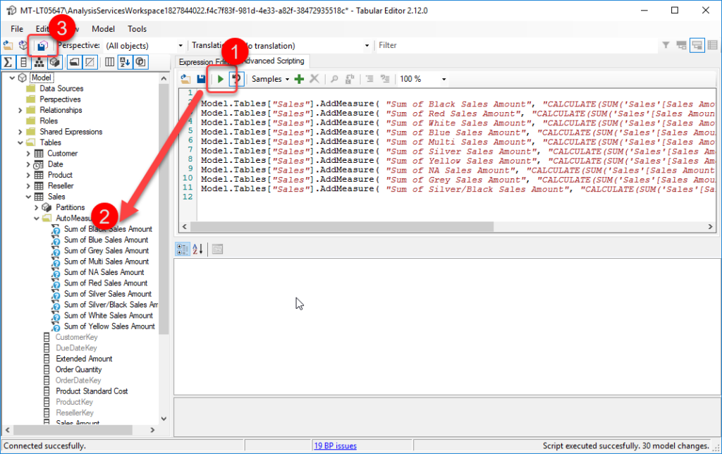
Below is a very brief tutorial on running a script using Tabular Editor 2
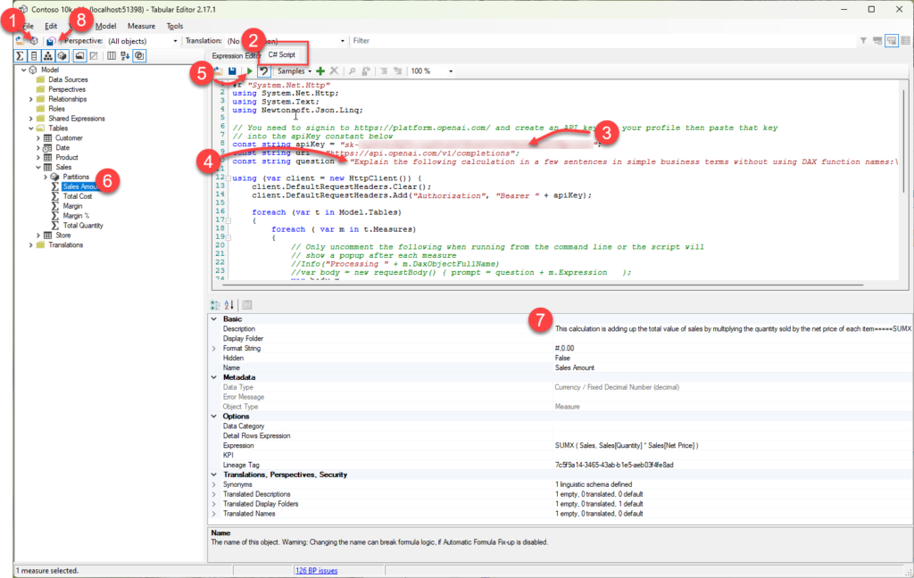
- If you launched Tabular Editor from the External Tools ribbon in Power BI desktop you can skip this step, otherwise click on this icon to connect to your data model.
- Click on the C# Script tab and paste in the script from my earlier post
- There are instructions in my earlier post for requesting your own API key from Open AI you need to paste the key into this line between the quotes (“)
- Optional: if you are targeting users that speak a language other than English you can update the question text on line 10 to your desired language (from what I understand ChatGPT understands about 100 different languages so you might need to test if this works in your language)
- Click the play button to run the script, this step could take a while depending on the number of measures and whether you hit throttling (more on this below)
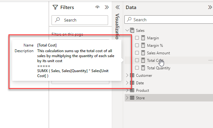
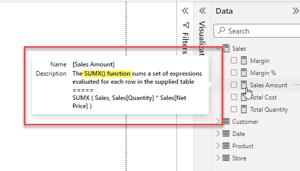
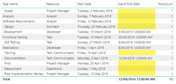
- Once the script has run you can check some of the descriptions by clicking on a measure in the model explorer. At this point all the descriptions are still local and have not been saved back to your data model.
- The text generated by ChatGPT will appear in the Description property for the measure.
- If you are happy with the generated descriptions clicking the Save Changes button will save the new descriptions back to your data model.
How to run the script using TE3
The steps for Tabular Editor 3 are almost the same with the main difference being at step 2 because TE3 allows you to have multiple C# scripts open at the same time.
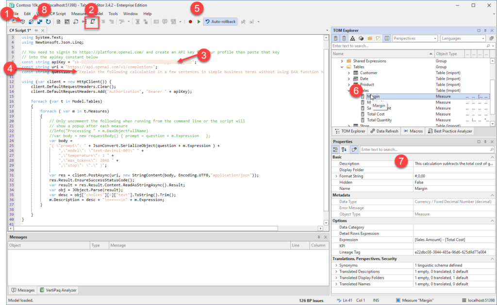
- If you launched Tabular Editor from the External Tools ribbon in Power BI desktop you can skip this step, otherwise click on this icon to connect to your data model.
- Click on the New C# Script button to create a C# script document and paste in the script from my earlier post
- There are instructions in my earlier post for requesting your own API key from Open AI you need to paste the key into this line between the quotes (“)
- Optional: if you are targeting users that speak a language other than English you can update the question text on line 10 to your desired language (from what I understand ChatGPT understands about 100 different languages so you might need to test if this works in your language)
- Click the play button to run the script, this step could take a while depending on the number of measures and whether you hit throttling (more on this below)
- Once the script has run you can check some of the descriptions by clicking on a measure in the model explorer. At this point all the descriptions are still local and have not been saved back to your data model.
- The text generated by ChatGPT will appear in the Description property for the measure.
- If you are happy with the generated descriptions clicking the Save Changes button will save the new descriptions back to your data model.
Dealing with Rate Limiting
If you have not worked with API calls before you may not have come across the term “rate limiting” before. Basically, it is a mechanism that APIs use to prevent users from monopolizing the resources on a service by limiting the number of calls that can be made within a given timeframe.
In the case of the Open AI APIs they document their rate limits here and at the time of writing they only allow 20 calls per minute for a free account. Once you hit that limit the API will return a 429 error code which is a common code meaning “Too many requests”. There are 2 approaches that you can use to work around this.
- You can add pauses in the code to wait until the next minute when you can then make another 20 calls.
- You can upgrade to a paid account which has much a higher limit.
If you would like to see an example of an updated script which will skip measures which already have descriptions (so if you’ve manually updated some or if there was an issue part way through running a previous script
Update Tabular Model Descriptions from ChatGPT with rate limiting logic (github.com)
A Final Warning
The Large Language Model (LLM) behind ChatGPT is an amazing piece of technology and it’s only going to get better over time. But I’ve also seen it described as “a B grade intern who hallucinates occasionally”. In it’s simplest form all these AI models do is to break a piece of text into a series of tokens and then predict what tokens are likely to come next based on a corpus of training material.
In my testing I’ve seen a number of examples where the prediction has missed some important detail. And in a couple of cases, I’ve even seen it include a modification to the original measure and then it has described the modified measure, not the original one!
So, while this is definitely a huge time saver, just be aware that it’s not perfect. Before publishing these descriptions into production, I would suggest doing a review of them to ensure that they make sense and include all the important details.
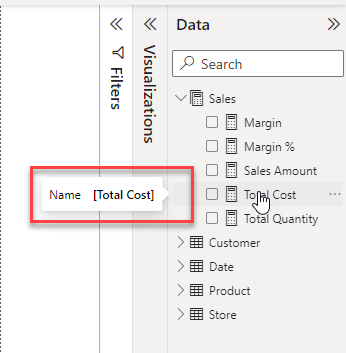
If you want to see all the descriptions at once you can use a tool like DAX Studio to run the following query to list them.
SELECT [Name], [Description], [Expression] FROM $SYSTEM.TMSCHEMA_MEASURES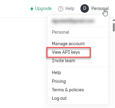


Recent Comments