So a while ago Power BI enabled the ability to display SVG images in tables and matrix visuals. SVG is an XML based language and is actually what the majority of Power BI visual use to render their charts so this technique works really well in Power BI and gives you a way of drawing custom elements in your reports without having to go down the path of building a full blown custom visual. There have been some interesting examples of using this feature such as the sparkline measures created by David Eldersveld (blog) and Reed Haven (blog) and even this funky elephant on hatfullofdata.blog. .
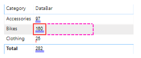
However recently a friend of mine was wanting a way to just build some simple custom data bars with dynamic coloring. So I pulled together an example which produces the following output:

Basically I’m using a text element to output the measure value and drawing a small rectangle under the text calculating the length of the rectangle based of the percentage of the max value. There is also a conditional statement to make amounts less than 50 appear in red.
The code to produce this is relatively simple and I’ve broken it down into a bunch of different variables to hopefully make it easier to understand.
DataBar =
    var _barMaxValue = MAXX(all(Sales[Category]), calculate(SUM(Sales[Amount])))
    var _barValue    = SUM(Sales[Amount])
    var _svgWidth    = 200
    var _svgHeight   = 200
    var _barHeight   = 30
    var _barWidth    = INT( (_barValue / _barMaxValue) * _svgWidth )
    var _fill        = IF( _barValue > 50, "blue", "red")
    var _svg_font    = "normal 100px sans-serif"
    var _svg_start   = "data:image/svg+xml;utf8,<svg xmlns='http://www.w3.org/2000/svg' viewBox='0 0 " & _svgWidth & " " & _svgHeight & "'>"
    var _svg_end     = "</svg>"
    var _svg_rect    = "<rect x='0' y='135' width='" & _barWidth & "' height='" & _barHeight & "' style='fill:" & _fill & ";fill-opacity:0.4' />"
    var _svg_text    = "<text x='5' y='120' witdh='" & _svgWidth & "' height='" & _svgHeight & "' style='font:" & _svg_font & "'>" & _barValue & "</text>"
return
    _svg_start &  _svg_rect & _svg_text  & _svg_end
The only “trick” to getting these SVG images to display correctly in the Table and Matrix visuals is to set their Data Category to ImageUrl. If you don’t do this the measure will just display the SVG as text (which could be useful for debugging more complex measures)

If you want to see a working example you can download an example pbix file from my OneDrive.
This was all relatively simple to do since I’ve worked with SVG before so it was not too hard to pull together something simple like this. The biggest problem that I had though was that Power BI restricts ImageUrl’s to only display inside a square, where as to build a nice custom data bar or sparkline using this technique you really want to work in a rectangular space that is 3-4 times wider than it is high.
So I’ve actually added and idea here to ideas.powerbi.com requesting that they change this in Power BI. Please vote for this if you think this would be a good idea.
Recent Comments