Random Procrastination

Darren Gosbell

Page 5 of 5

Power BI: How to make the Gantt chart show events in progress

I had a colleague approach me at work with an interesting problem. He had a Power BI report using the Gantt chart custom visual however when he used a date slicer to select a date range it was only showing events which started on that date range and he wanted to see any events that were in progress for that date range.

I figured out a way to get this working and I thought it might be helpful to not just show the solution, but also to walk through the process I used to develop it. Let’s start by looking at an example of the issue he was dealing with.

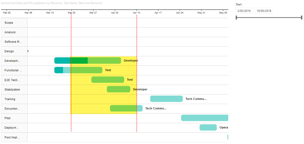
Given the following data, what he wanted was to filter the data for dates between Mar-20 to Apr-10 so that the Gantt chart would show the section in Yellow below:

But he was getting output like the following, where it was only showing the bottom 3 tasks from the image above with a start date between Mar-20 and Apr-10. It was not showing tasks which were already in progress like the first two (Division… and Functional…).

To figure out what options we had to change this default behaviour I turned on the Performance Profiler in Power BI Desktop (I could also have used the All Queries trace in DAX Studio). This captured the following query for the Gantt visual:

// DAX Query
DEFINE VAR __DS0FilterTable = 
  FILTER(
    KEEPFILTERS(VALUES('Table1'[Start Date])),
    AND('Table1'[Star Date] >= DATE(2016, 3, 20), 'Table1'[Start Date] < DATE(2016, 4, 11))
  )

EVALUATE
  TOPN(
    1002,
    SUMMARIZECOLUMNS(
      'Table1'[Task Name],
      'Table1'[Task ID],
      'Table1'[Start Date],
      'Table1'[Resource],
      __DS0FilterTable,
      "MinEnd_Date", CALCULATE(MIN('Table1'[End Date]))
    ),
    'Table1'[Task ID],
    1,
    'Table1'[Task Name],
    1,
    'Table1'[Start],
    1,
    'Table1'[Resource],
    1
  )

ORDER BY
  'Table1'[Task ID], 'Table1'[Task Name], 'Table1'[Start], 'Table1'[Resource]

There are two important parts to notice from the above query.

First is that the filter is currently explicitly filtering for start dates based on the values selected in the slicer. Obviously this is going to cause an issue as events that are already in-progress will have a start date before the earliest date in the slicer.

To fix this we need to create a separate date table that does not have a relationship to our main fact table. In the demo file I simply created a calculated table using Date Slicer = CALENDARAUTO() but you can use whatever method you like to create this table.

If we replace the 'Table1'[Start Date] field used in the slicer that “fixes” our issue of start dates earlier than those in the slicer being filtered out, but now our slicer is not filtering the data at all, but all is not lost, we will fix that next.

The second interesting thing that I noticed from the captured query is that [Start Date] is being used as a grouping column in the SUMMARIZECOLUMNS() function, but [End Date] is getting the earliest end using CALCULATE(MIN('Table1'[End Date])). What is happening is that the Gantt chart is creating an implied measure when we pass in the [End Date] column. So instead of letting the Gantt chart create an implied measure we can create our own measure and use that instead.

Below is the measure I developed

Gantt End Date = 
VAR _maxDate =
    MAX ( 'Date Slicer'[Date] )
VAR _minDate =
    MIN ( 'Date Slicer'[Date] )
VAR _tasks = VALUES(Table1[Task ID])
RETURN
    MAXX (
        CALCULATETABLE (
            SUMMARIZE( Table1, Table1[Start Date], Table1[End Date] ),
            Table1[Start Date] <= _maxDate,
            Table1[End Date] >= _minDate,
            _tasks
        ),
        Table1[End Date]
    )

This gives us the following

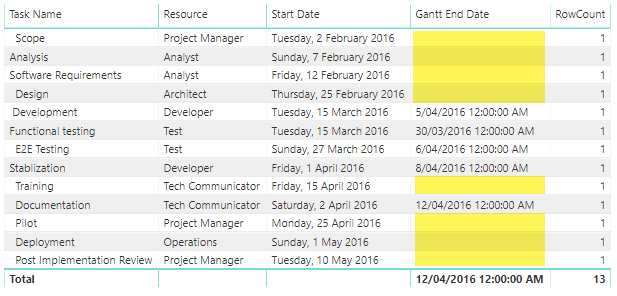
If you look at the output of this measure in a table all it does is the following:

Note that I’ve force the display of all rows by including a simple row count measure. This lets us see that the [Gantt End Date] only returns values where the End date is after the start of the selected date range and the start is before the end of the selected date range, otherwise it returns a blank and SUMMARIZECOLUMNS does not return rows where all the measures return blank.

If you want to look at the Power BI file I used in the screenshots for this post you can download it from here

Do the ALL() and REMOVEFILTERS() functions always work correctly in DAX?

I was recently re-reading through Matt Allington’s post that he did back when the REMOVEFILTERS() function was first introduced into the DAX language and I saw this post in the comments:

If a report is set up using the filter panel instead of slicers, will these filtering functions (ALL, REMOVEFILTERS, FILTER, ALLSELECTED, etc.) work as expected? For example if reporting percentages will the denominator calculate correctly?

John Thomas

Now it does not really matter if filter conditions are set using slicers or the filter panel. At the end of the day they get injected into the DAX query for a visual in the same way. You can check this yourself by creating a test file with 2 pages with the same visual, one with a slicer and the other with a page filter, then use the Performance Analyzer or the All Queries trace in DAX Studio to see the DAX query generated by both pages for that visual.

So the simple answer to this question is “yes” – if the filters work with slicers, they will work with the filter panel.

BUT, the astute among you may have noticed that I’ve qualified my answer by adding if the filter conditions work with slicers”. Which might lead you to wonder- “Are there scenarios where the filter conditions don’t work?”. And when we are talking about filter modifiers like ALL() and REMOVEFILTERS() there are some scenarios where the results may be unexpected due to the way the the SUMMARIZECOLUMNS() function correlates filters from the same table together. If you want to find out more I suggest the you read through this article by Greg Baldini over on antifound.com which contains an in-depth analysis of this issue.

DAX Studio 2.10.2 Released

I’ve just released the 2.10.2 update to DAX Studio.

Starting with the 2.10.0 releases the crash reporting has been improved as there was previously an edge case where certain types of crashes were not triggering the crash report dialog. So this release includes a number of stability updates that have come from people submitting crash reports.

There are also a few smaller features that are detailed below

New Features

  • #274 Adding Editor Word Wrap to options screen
  • #270 Added option to display current user in title bar
  • Added Dax Formatter option to omit spaces after function names

Fixes

  • fixed crash when selecting PBI / SSDT connection, but not selecting a file
  • fixed crash when running a query that produces no rows and using the Static Excel Output
  • fixed #272 Vertipaq Analyzer not working if any tables have a single quote in the name
  • fixed a number of crashes reported via the crash report dialog
  • improved a number of background threading calls to use the simpler async/await pattern
  • moved checking for schema changes on activating DAX Studio to a background thread to prevent the UI freezing for slow connections (AAS) or if there are active commit locks.

DAX Studio 2.10.1 release

It seems that the last few years I’ve always seemed to do a pre-Christmas release for DAX Studio and this year is no different. The latest update of DAX Studio has just been released which includes a number of new features and bug fixes which are outlined below.

You can download the latest release from https://daxstudio.org

Database Tooltip

Database Tooltip

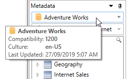
When you hover over the database dropdown in the metadata pane we now display an informational tooltip which includes the compatibility level of the database, the culture of the database and the date the data was last refreshed.

New Options

A couple of new settings have been added File – Options screen

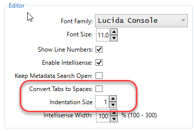
The first lets you configure whether the editor inserts tabs or spaces when you indent code. This can be useful if you use other code editors and wish to keep a consistent style across them all.

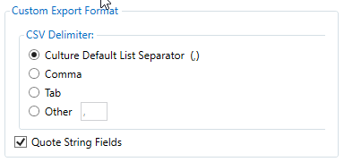
The second lets you configure a custom export format by specifying a delimiter to use and whether or not to always quote string fields (however if your strings include your delimiter field they will still be automatically quoted as not doing this would not allow the file to be consumed properly).

This configuration appears as an option when you save query results to a file target or when you use the Export Data Wizard

Vertipaq Analyzer

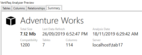
A new Summary Pane has been added to the Vertipaq Analyzer view. This page gives the user a single place to see summary information about the model including the total number of tables and the total size of the model.

The tables pane now has a new column that indicates if any of the relationships for that table have RI violations. This uses the DMV that Phil Seamark pointed out in his recent blog post

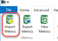
You can now also import metrics that were previously exported

Date Table indicator

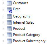
The metadata pane has been updated to indicate if a table has been marked as a “Date” table.

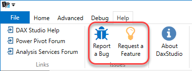
Ribbon buttons for Issues and Feature requests

I have seen a few issues posted in various other forums like the Power BI community forum over the years so I’ve decided to add buttons to the help ribbon to allow a quick and direct way of posting issues directly to our github issues list (although a github login is still required)

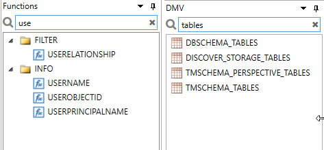
Search for Functions and DMVs

Both the Function and DMV panes now have a search box.

Fixes

And in addition to the above features it includes numerous bug fixes including the following:

  • #224 Server Timings and Query Plan traces now work with the EffectiveUsername connection string parameter
  • #237 fixed population of UserName field in traces
  • #223 Export Wizard now replaces characters that are not legal in file names with underscores
  • #222 UTF-8 csv exports no longer include BOM characters
  • #218 Vertipaq Analyzer – fixed an issue trying to export a model with a multiple of 50 +1 columns
  • #238 Vertipaq Analyzer – fixed Column Header name for Data Type column
  • Vertipaq Analyzer – fixed not showing any output for certain models #235 #231 #218
  • #213 fixed a bug that was not allowing “DEFINE MEASURE” to work with KPIs
  • #241 fixed File – New creating 2 blank windows (thanks @Mankarse)
  • #226 removed OnDragEnter debug message

Known Issues

There is an ongoing issue with some people getting an error from the Excel Add-in reporting a MissingMethodException which is preventing connections to PowerPivot models. However I’ve double checked a copy of the dll in question and it does contain the method so this error does not make any sense. And I have been unable to reproduce this issue on any of the systems which I have access to. If anyone is able to assist with more information on how to reproduce this issue I’d love to hear from you as I’d like to get this issue fixed.

Building custom Data Bars in Power BI using SVG measures

So a while ago Power BI enabled the ability to display SVG images in tables and matrix visuals.  SVG is an XML based language and is actually what the majority of Power BI visual use to render their charts so this technique works really well in Power BI and gives you a way of drawing custom elements in your reports without having to go down the path of building a full blown custom visual. There have been some interesting examples of using this feature such as the sparkline measures created by David Eldersveld (blog) and Reed Haven (blog) and even this funky elephant on hatfullofdata.blog. .

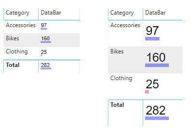
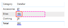
However recently a friend of mine was wanting a way to just build some simple custom data bars with dynamic coloring. So I pulled together an example which produces the following output:

Basically I’m using a text element to output the measure value and drawing a small rectangle under the text calculating the length of the rectangle based of the percentage of the max value. There is also a conditional statement to make amounts less than 50 appear in red.

The code to produce this is relatively simple and I’ve broken it down into a bunch of different variables to hopefully make it easier to understand.

DataBar = 
    var _barMaxValue = MAXX(all(Sales[Category]), calculate(SUM(Sales[Amount])))
    var _barValue    = SUM(Sales[Amount])
    var _svgWidth    = 200
    var _svgHeight   = 200
    var _barHeight   = 30
    var _barWidth    = INT( (_barValue / _barMaxValue) * _svgWidth )
    var _fill        = IF( _barValue > 50, "blue", "red")
    var _svg_font    = "normal 100px sans-serif"
    var _svg_start   = "data:image/svg+xml;utf8,<svg xmlns='http://www.w3.org/2000/svg' viewBox='0 0 " & _svgWidth & " " & _svgHeight & "'>"
    var _svg_end     = "</svg>"
    var _svg_rect    = "<rect x='0' y='135' width='" & _barWidth & "' height='" & _barHeight & "' style='fill:" & _fill & ";fill-opacity:0.4' />"
    var _svg_text    = "<text x='5' y='120' witdh='" & _svgWidth & "' height='" & _svgHeight & "' style='font:" & _svg_font & "'>" & _barValue & "</text>"
return
    _svg_start &  _svg_rect & _svg_text  & _svg_end

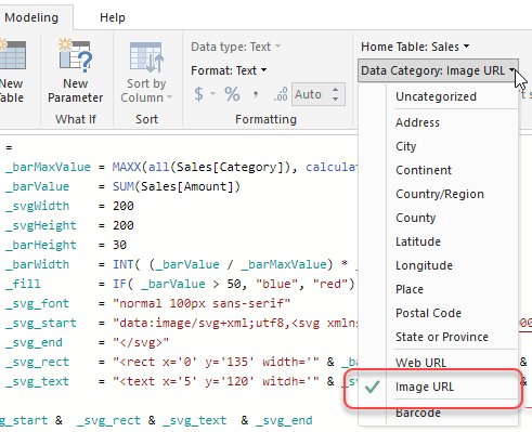
The only “trick” to getting these SVG images to display correctly in the Table and Matrix visuals is to set their Data Category to ImageUrl. If you don’t do this the measure will just display the SVG as text (which could be useful for debugging more complex measures)

If you want to see a working example you can download an example pbix file from my OneDrive.

This was all relatively simple to do since I’ve worked with SVG before so it was not too hard to pull together something simple like this. The biggest problem that I had though was that Power BI restricts ImageUrl’s to only display inside a square, where as to build a nice custom data bar or sparkline using this technique you really want to work in a rectangular space that is 3-4 times wider than it is high.

So I’ve actually added and idea here to ideas.powerbi.com requesting that they change this in Power BI. Please vote for this if you think this would be a good idea.

Extending the Analysis Services Command Timeout in Power BI

There was a question recently in the Power BI forums on how to extend the timeout for a connection to Analysis Services used to import data into Power BI. In other tools you can add a setting like “Timeout=600” to the connection string to extend this timeout, but the Analysis Services connector in Power BI does not expose a way to set the raw connection string.

image

However if you look at the Source step in PowerQuery you’ll see that it calls the AnalysisServices.Database() function and if you check the documentation for this function you will see the following

CommandTimeout : A duration which controls how long the server-side query is allowed to run before it is canceled. The default value is driver-dependent.

So based on the above information my first attempt was to change the call to this function as follows, however this just resulted in an error:

image

This caused a fair bit of head scratching, but if you re-read the documentation carefully you’ll notice the following “CommandTimeout : A duration …”  and a duration is a specific data type in the M language which you can instantiate using the #duration( <days>, <hours>, <minutes>, <seconds>) constructor.

So changing the CommandTimeout option to the following fixes this issue and has the added benefit of being clearer that the timeout is now 5 minutes (when using the connection string parameter its never completely clear what the units of the timeout are)

= AnalysisServices.Databases(“localhost\tab17″, [TypedMeasureColumns=true, Implementation=”2.0”, CommandTimeout=#duration(0,0,5,0)])

A New Begining

After many happy years on my previous blog platform I decided that it was time for a move. All my previous posts are still available at http://geekswithblogs.net/darrengosbell but from now on all my new content will be posted on this site. Although geekswithblogs.net had a bright start many years ago it is now suffering from neglect, the rss feed had unresolved issues, the comment engine and contact pages were completely broken and they don’t support https.

So I decided that now was the time to move my blog and give it a facelift in the process.

Newer posts »