Have you ever run a DAX query from DAX Studio (or using a DAX window in SSMS) and wondered why the format you set on a measure does not always seem to get applied?
Let’s start with the following simple DAX query which simply lists the month number from 1 to 12 and a measure.
EVALUATE
ADDCOLUMNS(VALUES('date'[Month])
,"Internet Total Sales"
, [Internet Total Sales]
)
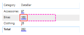
If we run this in DAX Studio you will see the following:
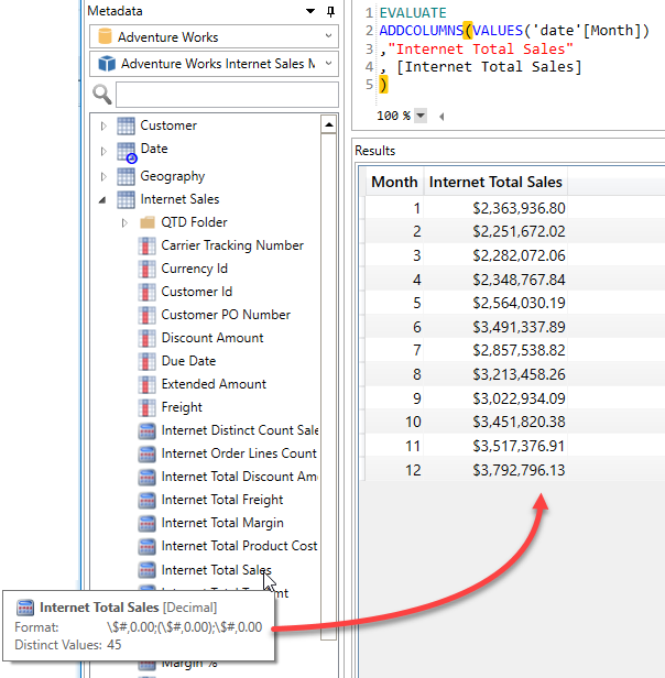
Note how the Format of the measure is correctly applied to return the dollar sign and the thousand separator and only 2 decimal places.
Now lets run the same query against the same model using SQL Server Management Studio (SSMS)
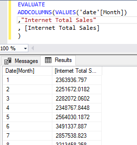
Now we have no currency symbol, no thousand separator and 3 to 4 numbers after the decimal place. What is going on here?
Well I’m going to let you in on a little secret about DAX queries:
The results in a DAX query are always returned unformatted.
You may well ask “Why is the formatting working in DAX Studio then?“. The answer is simple, I’ve specifically added code that looks at the column names returned by a query and then looks for a measure with the same name and applies any format string it finds.
You’ll notice in the example query that I’m setting the column name to the same name as the measure. If I change the column name to “AAA” you will see the following output.
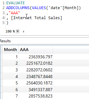
Which is the same “raw” format we see from SSMS.
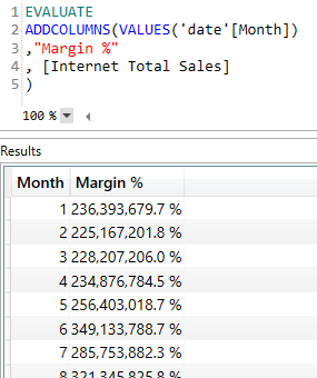
And if we exploit this for evil purposes we can even change the column name in the output to match a completely different measure. In the screenshot below I am applying the “Margin %” format to the [Internet Total Sales] measure so that it has one decimal place and a percentage sign and the decimal place is shifted two points to the right. I can’t think of a practical use for this behaviour, but you may see it occasionally if you are editing a query and change the measure reference without updating the column name.
You usually never see this in a client tool like Power BI as it builds the DAX queries internally so it knows which measures map to a given column in the result set so it can then apply the formatting appropriately.
If you’ve been following along with some of these example queries there is one other formatting feature we have in DAX Studio which you may have run into and that is the “Automatically Format Results” setting under File > Options.
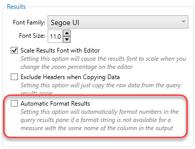
This is off by default, but if you switch it on DAX Studio will apply some basic formatting based on the data type of the column in an attempt to try and make the results easier to read.
If the column is an integer use the format string “#,0” (this should include the appropriate thousands separator based on the language settings of your pc)
If the column is a decimal use the format “#,0.00”
If the column is a decimal number AND the name includes “pct” or “%” then use the format “0.00%”
This formatting of results is just one of the many small ways that I try to improve the user experience when working with queries in DAX Studio.


Recent Comments