I had a colleague approach me at work with an interesting problem. He had a Power BI report using the Gantt chart custom visual however when he used a date slicer to select a date range it was only showing events which started on that date range and he wanted to see any events that were in progress for that date range.
I figured out a way to get this working and I thought it might be helpful to not just show the solution, but also to walk through the process I used to develop it. Let’s start by looking at an example of the issue he was dealing with.
Given the following data, what he wanted was to filter the data for dates between Mar-20 to Apr-10 so that the Gantt chart would show the section in Yellow below:
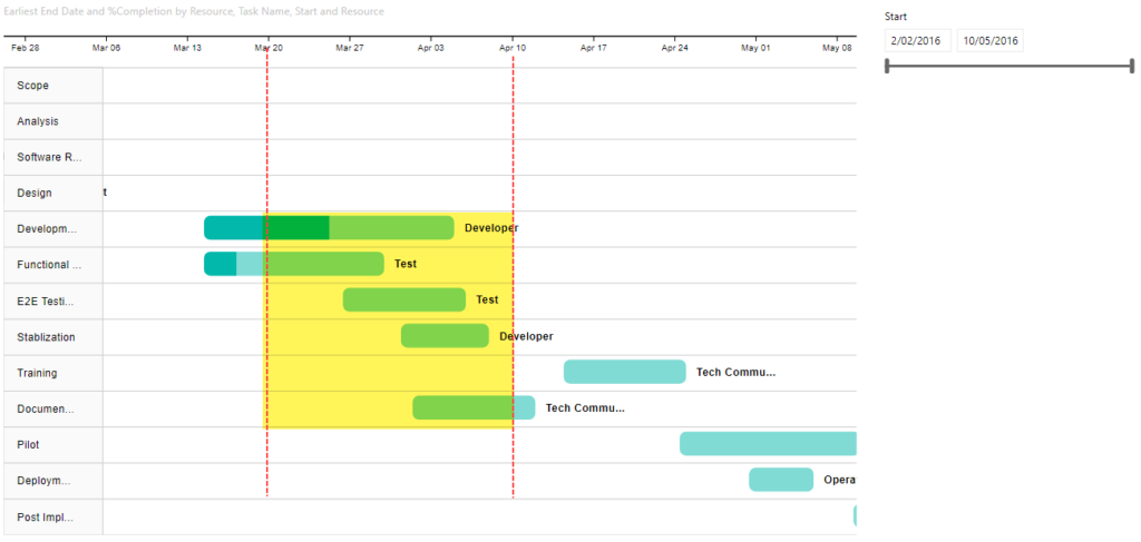
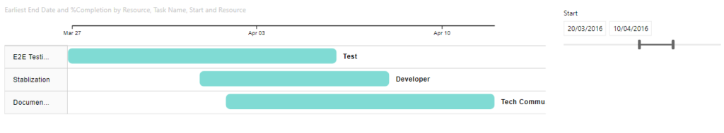
But he was getting output like the following, where it was only showing the bottom 3 tasks from the image above with a start date between Mar-20 and Apr-10. It was not showing tasks which were already in progress like the first two (Division… and Functional…).
To figure out what options we had to change this default behaviour I turned on the Performance Profiler in Power BI Desktop (I could also have used the All Queries trace in DAX Studio). This captured the following query for the Gantt visual:
// DAX Query
DEFINE VAR __DS0FilterTable =
  FILTER(
    KEEPFILTERS(VALUES('Table1'[Start Date])),
    AND('Table1'[Star Date] >= DATE(2016, 3, 20), 'Table1'[Start Date] < DATE(2016, 4, 11))
  )

EVALUATE
  TOPN(
    1002,
    SUMMARIZECOLUMNS(
      'Table1'[Task Name],
      'Table1'[Task ID],
      'Table1'[Start Date],
      'Table1'[Resource],
      __DS0FilterTable,
      "MinEnd_Date", CALCULATE(MIN('Table1'[End Date]))
    ),
    'Table1'[Task ID],
    1,
    'Table1'[Task Name],
    1,
    'Table1'[Start],
    1,
    'Table1'[Resource],
    1
  )

ORDER BY
  'Table1'[Task ID], 'Table1'[Task Name], 'Table1'[Start], 'Table1'[Resource]
There are two important parts to notice from the above query.
First is that the filter is currently explicitly filtering for start dates based on the values selected in the slicer. Obviously this is going to cause an issue as events that are already in-progress will have a start date before the earliest date in the slicer.
To fix this we need to create a separate date table that does not have a relationship to our main fact table. In the demo file I simply created a calculated table using Date Slicer = CALENDARAUTO() but you can use whatever method you like to create this table.
If we replace the 'Table1'[Start Date] field used in the slicer that “fixes” our issue of start dates earlier than those in the slicer being filtered out, but now our slicer is not filtering the data at all, but all is not lost, we will fix that next.
The second interesting thing that I noticed from the captured query is that [Start Date] is being used as a grouping column in the SUMMARIZECOLUMNS() function, but [End Date] is getting the earliest end using CALCULATE(MIN('Table1'[End Date])). What is happening is that the Gantt chart is creating an implied measure when we pass in the [End Date] column. So instead of letting the Gantt chart create an implied measure we can create our own measure and use that instead.
Below is the measure I developed
Gantt End Date =
VAR _maxDate =
    MAX ( 'Date Slicer'[Date] )
VAR _minDate =
    MIN ( 'Date Slicer'[Date] )
VAR _tasks = VALUES(Table1[Task ID])
RETURN
    MAXX (
        CALCULATETABLE (
            SUMMARIZE( Table1, Table1[Start Date], Table1[End Date] ),
            Table1[Start Date] <= _maxDate,
            Table1[End Date] >= _minDate,
            _tasks
        ),
        Table1[End Date]
    )
This gives us the following
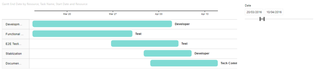
If you look at the output of this measure in a table all it does is the following:
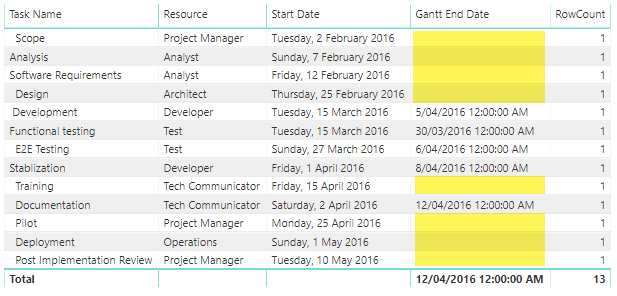
Note that I’ve force the display of all rows by including a simple row count measure. This lets us see that the [Gantt End Date] only returns values where the End date is after the start of the selected date range and the start is before the end of the selected date range, otherwise it returns a blank and SUMMARIZECOLUMNS does not return rows where all the measures return blank.
If you want to look at the Power BI file I used in the screenshots for this post you can download it from here
Genius! Thanks for sharing.
Hi!
Nice trick.
There is also another way that solves the problem. In End Date well of Gantt Chart place Table1[End Date] instead of you measure.
Then add the following measure as a filter for this visual. (I slightly modified your measure)
_Include =
VAR _maxDate =
MAX ( ‘Date Slicer'[Date] )
VAR _minDate =
MIN ( ‘Date Slicer'[Date] )
RETURN
If(
ISEMPTY(
CALCULATETABLE (
SUMMARIZE( Table1; Table1[Start Date]; Table1[End Date] );
Table1[Start Date] = _minDate
)
);
BLANK();
1
)
Apply “1” as a filter. The result will be the same, at least as it seems at a first glance 🙂
Hi Sergy, I think there might be a bug in your CALCULATETABLE() filter where you have
[Start Date] = _minDate. But I can see how this approach would work – It’s logically a similar approach to my one. However I would be wary of the SUMMARIZETABLE call, it’s difficult to measure in a small “toy” model like the one in this article, but that could introduce a materialization that might cause performance issues on a larger model.I see that the code is incorrect. Something went wrong during pasting and I didn’t spot that. I’ll try one more time 🙂
CALCULATETABLE (
SUMMARIZE( Table1; Table1[Start Date]; Table1[End Date] );
Table1[Start Date] = _minDate
)
Don’t know what happens. My comment was distorted again. Sorry.
Very strange, I’m assuming that you want similar filter to the one in my measure:
 Table1[Start Date] <= _maxDate,
 Table1[End Date] >= _minDate,
Actually I think the following code is probably better than the version in my article above as it gets rid of the SUMMARIZE:
Gantt End Date =VAR _maxDate =
MAX ( 'Date Slicer'[Date] )
VAR _minDate =
MIN ( 'Date Slicer'[Date] )
RETURN
CALCULATE(
MAX (Table1[End Date]),
Table1[Start Date] <= _maxDate, Table1[End Date] >= _minDate
)
Thanks Darren – really useful.
I didn’t realise there was such a useful Gantt chart visual available either . Will definitely be using that!
Hi Darren,
This is useful but is there a way to just show snap shot between 2 dates.
In the first image above you said that you just want the Gant chart to show between Mar 20 to Apr 10. But your end result shows Gant chart that is from March 15 to Apr 12 (this is because first two activities start on March 15 and last activity end on Apr 12).
I don’t care if they start before Mar 20 or end after Apr 10. I just want to show all activities that are on going or completed between these 2 dates.
Any help in this are will be appricated.
Thanks,
Rashid
Hi Rashid, I’m sorry, but I don’t understand how your requirement for ” I just want to show all activities that are on going or completed between these 2 dates.” is different to what I’m doing in this blog post. Can you provide some sample data, with an activity , start date and end date and then explain which ones you would expect to see for a given date filter? Or even use my example file and give me an example date range where you require different filtering to occur.
Darren – great solution for End, to Rashid’s question (I have the same one) – in your dataset, ex: Scope runs from Feb 2-Feb 6, so if you set the slicer to start at Feb-4, it will correctly keep Scope on the visual…however, the overall start date for the visual will remain Feb 2, because that’s the earliest start date for an active task being shown. What I suspect Rashid is also looking for is any way to trick the visual into reflecting the Start Date from the slicer, in effect to create a snapshot of just the data the falls immediately in the range specified, bounded by those dates. Development may be easier to replicate with because it’s a longer runway – if I set the range on your file to start at 4/1, the visual will remain starting 3/15.
Unfortunately, I don’t believe there is currently any way to achieve what you are after. To take the “Development” example the 3/15 date is a column value. To cut this off at 4/1 we would need some way of defining a query scoped calculated column in Power BI and that does not exist at the moment. I don’t think it’s possible to truncate the values in the visual itself since it is not directly aware of the date slicer, it only response to changes in the data set that Power BI feeds it. Maybe if someone were to build a custom Gantt visual that had a special “Start Date” field well this would be possible. But I’m not aware of anything like this.
Hi Darren,
This is a very nice way of showing the correct projects. The downside is that the gantt’s granularity does not change anymore.
When the start or enddate of projects is affected by the (time) slicer, the gantt shows the granularity chosen in the slicer (quarter, month, week, …).
However, when a slicer acts upon non-related dates, gantt granularity does not change.
Would you happen to know if there’s a way around this problem?
Kr,
Peter
No sorry I don’t actually use the Gantt chart all that much myself, I figured out this technique while helping out a colleague. I’ve never observed the behaviour you describe, I thought the scale had to be set in the chart settings.
Hello! Thanks for the walk-through. Question: is there any way to roll up the Duration Units to Months? I only see Days, Hours, Minutes, and Seconds. I would like to see the full year in one view without scrolling.
Thanks
Yes there is. You can go into the formatting properties of the Gantt visual and change the “Date type” property to “Month”. (I also see Year, Quarter, Month, Week in my example pbix file)
Thanks for sharing this solution. I do have another question relating to this. I would like to add card visual that shows the count of the Task ID. When I do this, the count is not affected by the Date slider. I downloaded your example, and it always shows 13. Is there a way to get the number of tasks based on what has been filtered?
So the filtering in the Gantt chart is done by the [Gantt End Date] measure. So you could create a copy of this measure including the [Task ID] in the SUMMARIZE call (just in case 2 tasks have the same start/end dates and then count those rows.
eg.
Distinct Tasks =

VAR _maxDate =

    MAX ( 'Date Slicer'[Date] )

VAR _minDate =

    MIN ( 'Date Slicer'[Date] )

RETURN

    COUNTX(

        CALCULATETABLE (

            SUMMARIZE( Table1, Table1[Task ID], Table1[Start Date], Table1[End Date] ),

            Table1[Start Date] <= _maxDate,
            Table1[End Date] >= _minDate

        ),

        Table1[Task ID]

    )
Thank you…that worked perfectly for me.
Hi Darren,
Thanks for your tip.
I am having a similar problem.
In my case , a single task has multiple start and end dates. If I use the above logic then everything overlaps and I am not able to visualise the duration available between successive start and end date.
Can you provide your help please ?
So you probably either need some unique id like a sub-task id if you want to see a separate row for each start/end date pair. Or you would want to aggregate the dates by doing something like getting the earliest start date and the latest end date for each task.
Thanks a lot Darren for Swift revert.
In my case , I don’t have any unique I’d for sub-task.
Regarding using earliest start date and latest end date for each task, again my visual will become very sensitive to the start and end date slicer.
Additionally, i understood that we cannot use measure in start date unlike in end date.
One of the workaround i found is to use duration (difference between start and end date) for each task in milestone but unfortunately then Power BI doesn’t allow to use end date.
The gaps are eventually filled (as I assume a singe start and end date is taken, rather than a set of start and end dates).
Would be extremely grateful if you can share the solution via power bi file.
Thanks a lot.
Additionally, I want to have the feature regarding end date measure which you explained i.e. showcasing the task based on newly generated date slicer rather than being sensitive to start date and end date slicer
Thanks a lot for Swift revert.
1-) Unfortunately I don’t have unique Sub-task for each task.
2-) I understood we cannot use measure for start date.
3-) I want to show case the task on Gantt chart based on the logic you defined on newly created measure of end date which you showcased.
What i understood is that this visual gives each sub-category a separate row and when these are minimised the gaps are filled (as I assume a singe start and end date is taken, rather than a set
Of start and end dates).
Can you share your thoughts via a power bi file ?
Thanks
> 1-) Unfortunately I don’t have unique Sub-task for each task.
Then you could generate one by concatenating your task identifier with the start and/or end dates.
I don’t really know what your data structure looks so there is not much point in me creating a made up pbix file and creating a surrogate key is the simple answer.
Hey Darren,
Thanks for the revert.
I see another issue with Gantt chart.
I am not able to visualise all the data points on Gantt chart. Somehow the Gantt chart truncates after few data points and doesn’t reflect all the data set.
Any idea on how to visualise every task on Gantt chart ir respective of their numbers?
It depends on what you mean by “a few data points” – all visuals have a limit of 30,000 records in the underlying dataset. But that is normally more than a person can reasonably read anyway. If you are seeing less than that then there is something else going on.